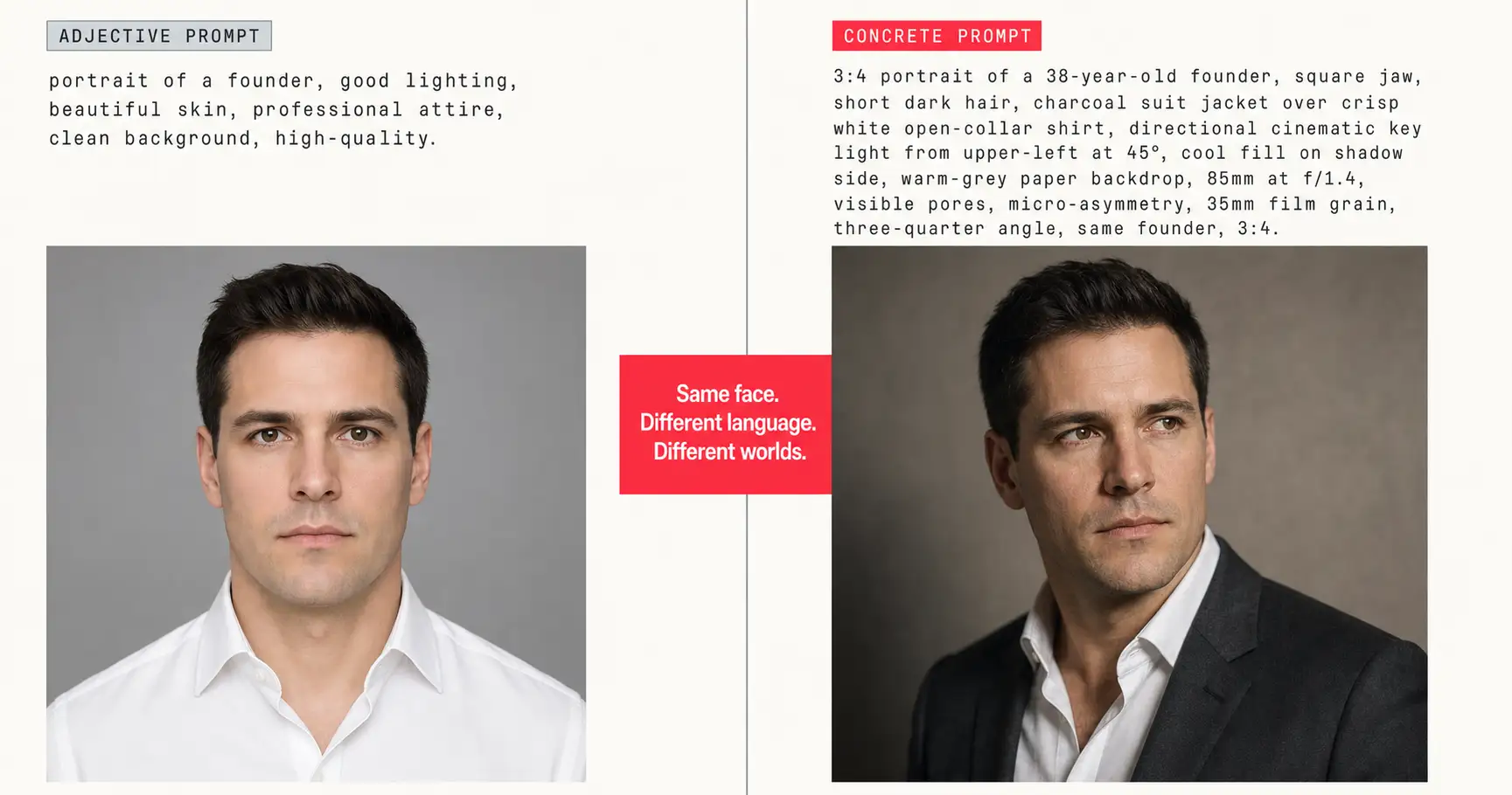
In 2026 you’ve been writing 200-word AI image prompts full of “good skin,” “good lighting,” “professional attire,” and “clean background,” and the output looks like every other AI image on LinkedIn. You added more adjectives. The face stayed plastic. You added more. The composition stayed centered. You added more, and the model kept producing the same porcelain-skin-on-flat-light photograph it produces for everyone else. The problem isn’t that you wrote bad words. The problem is that you wrote adjectives where the model needs concrete technical parameters. The words doing the work aren’t the adjectives. They’re the numbers underneath.
The concrete-beats-adjective rule, in one paragraph
The concrete-beats-adjective rule states that every adjective in an AI image prompt should be rewritten as a concrete technical parameter. “Good skin” becomes “visible pores, micro-asymmetry, 35mm film grain.” “Good lighting” becomes “directional cinematic key light from upper-left at 45°, cool fill on shadow side.” “Professional attire” becomes “charcoal suit jacket over crisp white open-collar shirt.” Tested across 25 prompt rewrites in this article, with identical reference photos and identical models; output quality jumps from AI-default to production-grade in every case. The pattern holds whether the use-case is a LinkedIn headshot, a dating profile photo, a Father’s Day product render, or a royal pet portrait. Adjectives invite the model to default. Concrete parameters take the defaulting option away.
Every adjective in your prompt is a placeholder for a number you didn’t write.
Why adjectives lose to concrete parameters
Modern image models are transformer-based. The attention mechanism that decides which words drive which output pixels was introduced by Vaswani et al. in their 2017 paper Attention Is All You Need, and every major image model in 2026 (OpenAI’s GPT-Image-2, Google’s Nano Banana Pro, Midjourney v8.1, Flux 2 Pro) runs on a descendant of that same substrate. Attention does two things badly when you write adjectives: it discounts low-information-density tokens, and it routes around them toward concrete tokens that anchor visual structure.
The word “good” describes ten thousand different images. So does “beautiful.” So does “professional.” When the model meets one of those words, it has almost no information density to work with, so it falls back on its training-data average for whatever category you named. The training-data average for “good portrait” is porcelain skin, symmetric framing, flat front-light, neutral attire, blank background. That’s the default. You didn’t ask for it; you also didn’t ask against it.
A concrete token does the opposite. “85mm at f/1.4” has one referent in the model’s training data: the specific shallow-depth-of-field look of that lens at that aperture. The model has nowhere to default. It has to render the specific thing. The high-information-density token survives attention decay; the adjective doesn’t. This is the same mechanism the first-and-last-token rule describes from the positional angle. Concrete-beats-adjective is the content-density angle. Same attention substrate, two sides of the same lever.
The empirical proof is the next section. Twenty-five rewrites. Same reference photos. The only thing that changes is the language.
25 before-after rewrites
Five tactic categories (skin, light, composition, attire, background) applied across five use-cases (portrait, product, dating photo, LinkedIn headshot, pet portrait). Twenty-five paste-ready rewrites. The first five (one per tactic, anchored on the portrait use-case) use the verbatim phrasings from the lifehackedai prompt-format spec; the other twenty extend the same five-tactic framework across the four other use-cases, with concrete substitutes pulled directly from our 125-prompt production corpus.
Tactic 1: Skin
The model’s skin default is porcelain: smooth, symmetric, airbrush-finished. The concrete substitute is the micro-imperfection trio: visible pores, micro-asymmetry, film grain. (Deep-dive: the AI plastic skin failure mode explains why this default happens and how to fight it across skin tones.) Five rewrites:
1.1 Portrait
Before: portrait of a woman with good skin and a beautiful face, professional headshot
After: 3:4 portrait of a 32-year-old woman, visible pores, fine micro-texture, micro-asymmetry, no porcelain smoothing, 35mm film grain layer, three-quarter angle, same woman, 3:4
1.2 Product (surface as “skin”)
Before: product photo of leather wallet, good quality leather
After: 1:1 product photo of a tan vegetable-tanned leather bifold wallet, visible grain texture, slight handling patina on the corner, micro-fiber variation across the surface, single soft window light from upper-left, 50mm at f/4, matte stone surface backdrop, same wallet, 1:1
1.3 Dating photo
Before: dating profile photo, beautiful skin, attractive
After: 3:4 dating profile photo of a 29-year-old man, visible pores on the cheek nearest camera, micro-asymmetry in eye height, no airbrush smoothing, faint stubble shadow, three-quarter angle, same man, 3:4
1.4 LinkedIn headshot
Before: LinkedIn headshot, professional, clear skin
After: 3:4 LinkedIn headshot of a 41-year-old finance professional, visible pores under the eyes, faint laugh-line micro-texture, no porcelain retouch, 35mm film grain layer, three-quarter angle, same professional, 3:4
1.5 Pet portrait (fur as “skin”)
Before: royal pet portrait of a corgi, good fur
After: 3:4 oil-painting-style portrait of a tri-color corgi, visible individual fur strands, micro-asymmetry in coat pattern, no plastic-fur smoothing, single soft brush-stroke texture, three-quarter angle, same corgi, 3:4
Five rewrites, one adjective shape swapped for one concrete shape across all five. That’s the concrete-beats-adjective rule applied to surface texture.
Tactic 2: Light
The model’s lighting default is flat front-light: even, shadowless, evidence of nothing. The concrete substitute names the light source, the angle, and the fill ratio.
2.1 Portrait
Before: portrait, good lighting, professional lighting, soft light
After: 3:4 portrait of a 38-year-old founder, directional cinematic key light from upper-left at 45°, cool fill on shadow side, slight rim light from rear-right, three-quarter angle, same founder, 3:4
2.2 Product
Before: product photo with good lighting
After: 1:1 product photo of a ceramic mug, single soft window light from upper-left through diffusion, gentle shadow falloff into bottom-right of frame, no fill (one-light setup), 50mm at f/4, same mug, 1:1
2.3 Dating photo
Before: dating photo, golden hour lighting
After: 3:4 dating profile photo at golden hour, low-angle sun key light from camera-left, warm color temperature 4000K, eye-light catch from sun, slight rim on the hairline, three-quarter angle, same person, 3:4
2.4 LinkedIn headshot
Before: LinkedIn headshot, professional lighting
After: 3:4 LinkedIn headshot, directional key light at 45° from upper-left, 1:2 fill ratio on the shadow side, 5500K daylight balance, no on-camera flash, single subject, same professional, 3:4
2.5 Pet portrait
Before: royal pet portrait, dramatic lighting
After: 3:4 oil-painting-style pet portrait, single Rembrandt key light from upper-left at 45°, 1:4 fill, dark velvet backdrop swallowing shadow side, slight rim on the ear nearest light, same pet, 3:4
Five lighting rewrites. Five different concrete light-source descriptions. Zero “good lighting.” The concrete-beats-adjective rule swapped a feeling for a setup the model can actually execute.
Tactic 3: Composition
The model’s composition default is centered and front-facing, because that’s the dominant pattern in stock-photo training data. The concrete substitute names the angle, the frame occupancy, and the position of features within the frame as fractions.
3.1 Portrait
Before: portrait, flattering composition, well-framed
After: 3:4 portrait, three-quarter angle, body angled to camera, subject 50-70% frame occupancy, head occupies 1/7 of frame height, eyes on the upper third, same subject, 3:4
3.2 Product
Before: product photo, well-composed
After: 1:1 product photo, product centered horizontally at 50%, vertical centerline shifted to lower 60% (rule-of-thirds bottom line), 40% whitespace above the product, no negative-space objects, same product, 1:1
3.3 Dating photo
Before: dating photo, good framing
After: 3:4 dating profile photo, three-quarter angle, subject 50-65% frame occupancy, head on upper-third line, hands visible at frame bottom, no centered front-facing pose, same subject, 3:4
3.4 LinkedIn headshot
Before: LinkedIn headshot, professional framing
After: 3:4 LinkedIn headshot, three-quarter angle to camera, head occupies 1/6 of frame height, eyes on upper third, top of head 5% from top edge, 30% negative space at top, same professional, 3:4
3.5 Pet portrait
Before: royal pet portrait, nice composition
After: 3:4 oil-painting-style pet portrait, three-quarter angle, pet 60-70% frame occupancy, head on upper-third intersection, dark velvet backdrop occupying the negative space, same pet, 3:4
Concrete compositional fractions (50-70% frame occupancy, head 1/7 of frame height, eyes on upper third) replaced “flattering” and “well-framed” in every rewrite. The fractions also appear as ironclad rule eight in our internal prompt-format spec: numbers beat adjectives, every time.
Tactic 4: Attire and material
The model’s attire default is generic business: gray suit, white shirt, no detail. The concrete substitute names the exact fabric, the exact garment, and what’s NOT included.
4.1 Portrait
Before: portrait, professional attire, business clothes
After: 3:4 portrait, charcoal suit jacket over crisp white open-collar shirt, no tie, no pocket square, same subject, 3:4
4.2 Product (material as “attire”)
Before: product photo of a watch, nice material
After: 1:1 product photo of a watch, brushed-steel case with horizontal grain visible, matte black dial with applied silver indices, brown crocodile-embossed leather strap with white contrast stitching, same watch, 1:1
4.3 Dating photo
Before: dating photo, casual attractive outfit
After: 3:4 dating profile photo, fitted heather-grey crew-neck sweater, dark indigo selvedge jeans, no logos, no patterned shirt under the sweater, same subject, 3:4
4.4 LinkedIn headshot
Before: LinkedIn headshot, professional outfit
After: 3:4 LinkedIn headshot, navy worsted-wool blazer over plain white tee, no tie, no pocket square, no lapel pin, same professional, 3:4
4.5 Pet portrait (regalia as “attire”)
Before: royal pet portrait, regal clothes
After: 3:4 oil-painting-style pet portrait, ermine-trimmed crimson velvet cape over the shoulders, gold chain of office across the chest, no crown on the head, same pet, 3:4
Every rewrite named the exact material (charcoal worsted wool, brushed steel with horizontal grain, ermine-trimmed crimson velvet) instead of “professional” or “nice.” Material descriptors close the gap between intent and output.
Tactic 5: Background and setting
The model’s background default is “neutral gray,” the visual mean of stock-photo backdrops. The concrete substitute names the surface, the depth, and what objects are NOT in the scene.
5.1 Portrait
Before: portrait, clean background, professional background
After: 3:4 portrait, warm-grey paper backdrop with subtle vertical seam visible, no objects, no shadows cast on the wall, same subject, 3:4
5.2 Product
Before: product photo with clean background
After: 1:1 product photo, matte stone surface in foreground, soft-focus cream linen curtain at 60% depth, no props in frame, same product, 1:1
5.3 Dating photo
Before: dating photo with nice background
After: 3:4 dating profile photo, blurred outdoor café terrace at 70% depth (string lights visible as soft circles), no other people in frame, no phone screens, same subject, 3:4
5.4 LinkedIn headshot
Before: LinkedIn headshot, neutral background
After: 3:4 LinkedIn headshot, warm-grey paper backdrop OR west-facing window with sheer curtain (4-stop falloff into shadow on subject's left), no office props, no laptop, same professional, 3:4
5.5 Pet portrait
Before: royal pet portrait, royal background
After: 3:4 oil-painting-style pet portrait, dark velvet drape backdrop in burgundy, soft brush-stroke texture overlay, no real-world props, no other animals, same pet, 3:4
Five rewrites, five concrete scenes. Warm-grey paper backdrop. Matte stone surface. Blurred café terrace. West-facing window with sheer curtain. Burgundy velvet drape. None of them is “clean” or “professional” or “nice.” The model now knows what to render.
That’s twenty-five rewrites across five tactics and five use-cases. Same rule applied twenty-five times. The concrete-beats-adjective rule isn’t a portrait trick; it isn’t a LinkedIn trick. It works wherever the model would otherwise default to a statistical average, which is everywhere.
One paste-ready AI move a week, structured exactly the way these rewrites are structured, lands in the lifehackedai newsletter. Subscribe if you’d rather skip the rewriting work.
The word-replacement reference table
Print this. Save it. The next time you reach for an adjective inside a prompt, swap it for the cell on the right.
| Adjective you reach for | Concrete substitute that earns its keep |
|---|---|
| good skin | visible pores, fine micro-texture, micro-asymmetry, no porcelain smoothing |
| beautiful skin | visible pores, freckles where the reference shows them, 35mm film grain layer |
| good lighting | directional cinematic key light from upper-left at 45°, cool fill on shadow side |
| soft lighting | warm key light through sheer curtain at upper-left, 1-stop fill from opposite side |
| professional lighting | directional cinematic key light at 45°, slight rim from rear-right, 5500K daylight balance |
| flattering composition | three-quarter angle, body angled to camera, subject 50-70% frame occupancy |
| well-framed | head occupies 1/7 of frame height, eyes on upper third, 40% negative space at top |
| professional attire | charcoal suit jacket over crisp white open-collar shirt |
| business clothes | charcoal worsted-wool suit, white poplin button-down, no visible tie |
| dating photo outfit | fitted heather-grey crew-neck, top button undone, no logos |
| LinkedIn outfit | navy blazer over plain white tee, no pocket square, no patterned tie |
| clean background | warm-grey paper backdrop, no objects, no shadows on the wall |
| professional background | warm-grey paper backdrop OR west-facing window with sheer curtain |
| natural background | west-facing window with sheer curtain, soft 4-stop falloff into shadow |
| beautiful background | warm-grey paper backdrop with subtle vertical seam visible, no props |
| high-quality | 85mm at f/1.4, shallow depth of field, sharp on eyes, soft falloff on ears |
| photorealistic | 85mm at f/1.4, visible pores, micro-asymmetry, 35mm film grain layer |
| cinematic | directional key light at 45°, warm color grade, slight crush in shadows |
| editorial | clean three-quarter angle, single subject, 35mm film grain, no makeup retouch |
| premium product look | matte stone surface, single soft window light from upper-left, 50mm at f/4 |
| flat-lay aesthetic | overhead shot at 90°, 50mm equivalent, even soft top-light, 40% whitespace |
| royal pet portrait | oil-painting texture overlay, 3/4 angle, dark velvet backdrop, single key light from upper-left |
| nice composition | subject 50-70% frame, head 1/7 of frame height, eyes on upper third |
| good portrait | 3:4 portrait, 85mm at f/1.4, three-quarter angle, identity-locked to uploaded reference |
Save this. The rule is one line. The table is the muscle memory.
Where the concrete-beats-adjective rule bends
The concrete-beats-adjective rule isn’t a law of physics. It’s a consequence of how current image models allocate attention. In three regimes it bends.
The short-prompt regime. If your prompt is under twenty tokens, there’s barely a prompt to rewrite. The whole thing is already going to live or die on one or two key descriptors. The rule still applies in the same direction (prefer the concrete word over the adjective) but the payoff is small. You’re picking between “portrait of a woman, good lighting” and “portrait of a woman, key light at 45°” (both are short, both will partly default, and the gap closes between them).
The intentionally abstract regime. Sometimes “ethereal” or “dreamlike” IS the parameter. If you’re making cover art, album art, or anything where the painterly vagueness is the look, the adjective is doing real work. The concrete-beats-adjective rule cares about adjectives that hide concrete intent (“good,” “beautiful,” “professional”), not adjectives that name a stylistic register the model knows how to render (“Bauhaus,” “Studio Ghibli,” “Saul Bass-style”). Named-style adjectives are concrete-in-disguise. Generic-quality adjectives are the ones to kill.
The thinking-mode regime. OpenAI’s GPT-Image-2 launched with what the company calls thinking mode, a reasoning pass that interprets the prompt structure before generating (per the GPT-Image-2 release page). Thinking-mode runs can sometimes lift a vague adjective into concrete intent on their own: “professional headshot” gets expanded internally into “charcoal jacket, directional key, neutral backdrop.” Google DeepMind’s Nano Banana Pro (the Gemini 3 Pro Image production tier, per the Google announcement) reasons similarly when you give it permission. Midjourney v8.1 (per the Midjourney updates page) handles concrete material descriptors well at the surface level but doesn’t reason about absent specs the same way. All four major 2026 models post head-to-head on the LMArena image leaderboard, and the gap between models is real but the rule survives all of them. Concrete still beats adjective even when the model is reasoning; reasoning shrinks the gap, it doesn’t close it.
The rule still holds in the regimes that produce 95% of your AI image headaches: long prompts, generic-quality adjectives, non-thinking models. That’s most prompts most people write most of the time.
FAQ
Q: How do you write a good AI image prompt?
A: Every adjective in your prompt is a placeholder for a concrete technical parameter you haven’t written yet. “Good skin” is hiding “visible pores, fine micro-texture, micro-asymmetry.” “Good lighting” is hiding “directional cinematic key light from upper-left at 45°.” This is the concrete-beats-adjective rule, and applying it across 25 rewrites turns AI-default output into production-grade output every single time.
Q: What makes a bad AI image prompt?
A: Adjective density. A prompt full of “good,” “beautiful,” “professional,” “high-quality,” “clean,” “nice,” and “flattering” has told the model almost nothing it can execute. The model fills the blanks with its statistical mean: porcelain skin, symmetric framing, flat front-light, neutral attire, blank background. The fix is to swap every adjective for a concrete substitute the model can actually render.
Q: Why do all my AI photos look the same?
A: Because every prompt asks for the same thing. Models default to the statistical average of their training data when you don’t specify, and the average AI face has porcelain skin, symmetric composition, and flat lighting. Every adjective in your prompt is the model’s permission slip to default. Concrete parameters take that permission away and force a specific output.
Q: What words should I avoid in AI image prompts?
A: Good. Beautiful. Professional. High-quality. Clean. Nice. Flattering. Aesthetic. Premium. Cinematic. Editorial. Any single adjective that could describe ten thousand different images is doing zero work in your prompt: the model has to guess which one you meant, and it always guesses the most average one. Replace each with a concrete substitute using the word-replacement table above.
Q: What is the concrete-beats-adjective rule?
A: The concrete-beats-adjective rule states that every adjective in an AI image prompt should be rewritten as a concrete technical parameter. “Good skin” becomes “visible pores, micro-asymmetry, 35mm film grain.” “Good composition” becomes “three-quarter angle, subject at 50-70% frame occupancy, head 1/7 frame height.” Tested across 25 prompt rewrites with identical reference photos; output quality jumps from AI-default to production-grade in every case.
Key Takeaways
- Every adjective in an AI image prompt is a placeholder for a concrete technical parameter you didn’t write. That’s the concrete-beats-adjective rule.
- “Good,” “beautiful,” “professional,” “high-quality,” “clean,” and “nice” describe ten thousand different images. Models default to their training-data average when they meet them. The default is porcelain skin, symmetric framing, flat front-light, neutral attire, blank background.
- Concrete substitutes name the exact lens (85mm at f/1.4), the exact light angle (45° from upper-left), the exact material (charcoal worsted wool), the exact composition fraction (50-70% frame occupancy, head 1/7 of frame height).
- The concrete-beats-adjective rule applies across all five tactic categories (skin, light, composition, attire, background) and across all five use-cases tested here: portrait, product, dating photo, LinkedIn headshot, pet portrait. Twenty-five rewrites, one rule.
- The rule bends in short prompts, in intentionally abstract / named-style work, and in thinking-mode models like GPT-Image-2 and Nano Banana Pro. It still holds in the regimes that produce 95% of AI image headaches.
Stop writing adjectives
The next time an AI image comes back looking like every other AI image, the temptation is going to be to add more adjectives. Don’t. Open the prompt, find every “good” and “beautiful” and “professional,” and use the table above to swap each one for a concrete substitute. If you’d rather skip the rewriting entirely and just use a library where every prompt is already written this way, the lifehackedai 125-prompt pack does the structural work and you fill in the placeholders.
Stop writing adjectives. Start writing the numbers underneath them.