Three weeks before the shoot, two closets are open and nothing is decided. What you wear for engagement photos comes down to two separate problems: how the two of you relate to each other, and how the fabric behaves on camera. Solve the first with one rule, coordinate, don’t match. Solve the second by skipping the handful of colors and patterns a camera punishes. Get both right and you look like a couple, not a costume.
Coordinate, Don’t Match
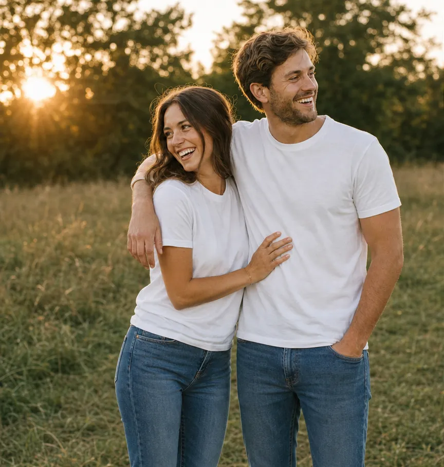
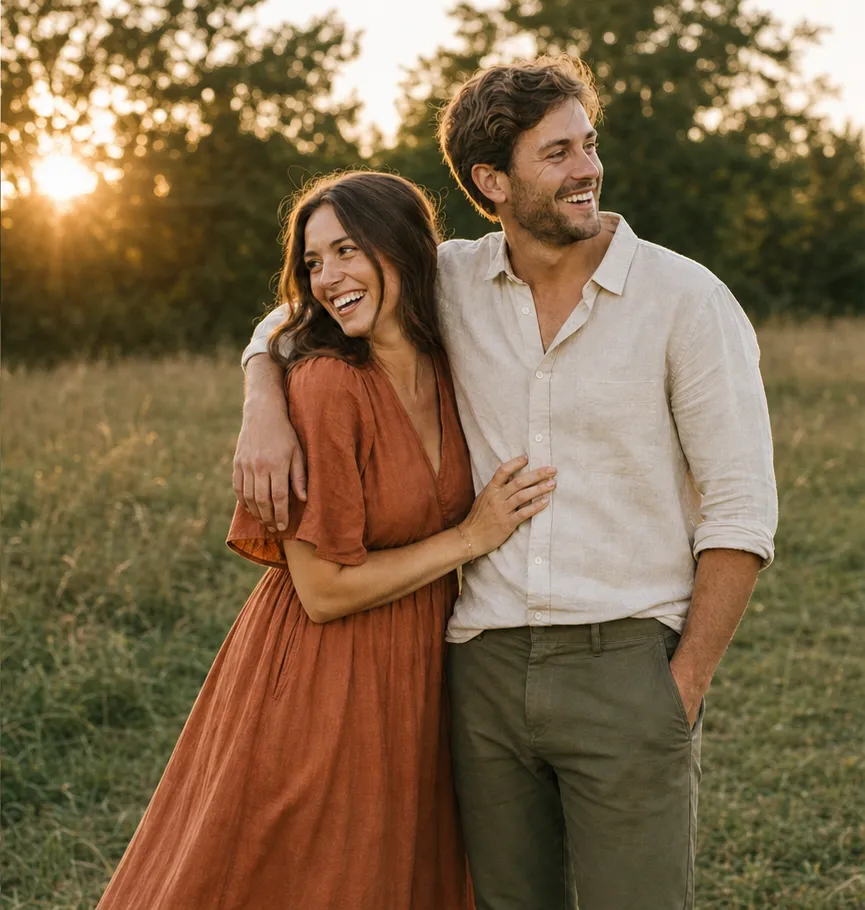
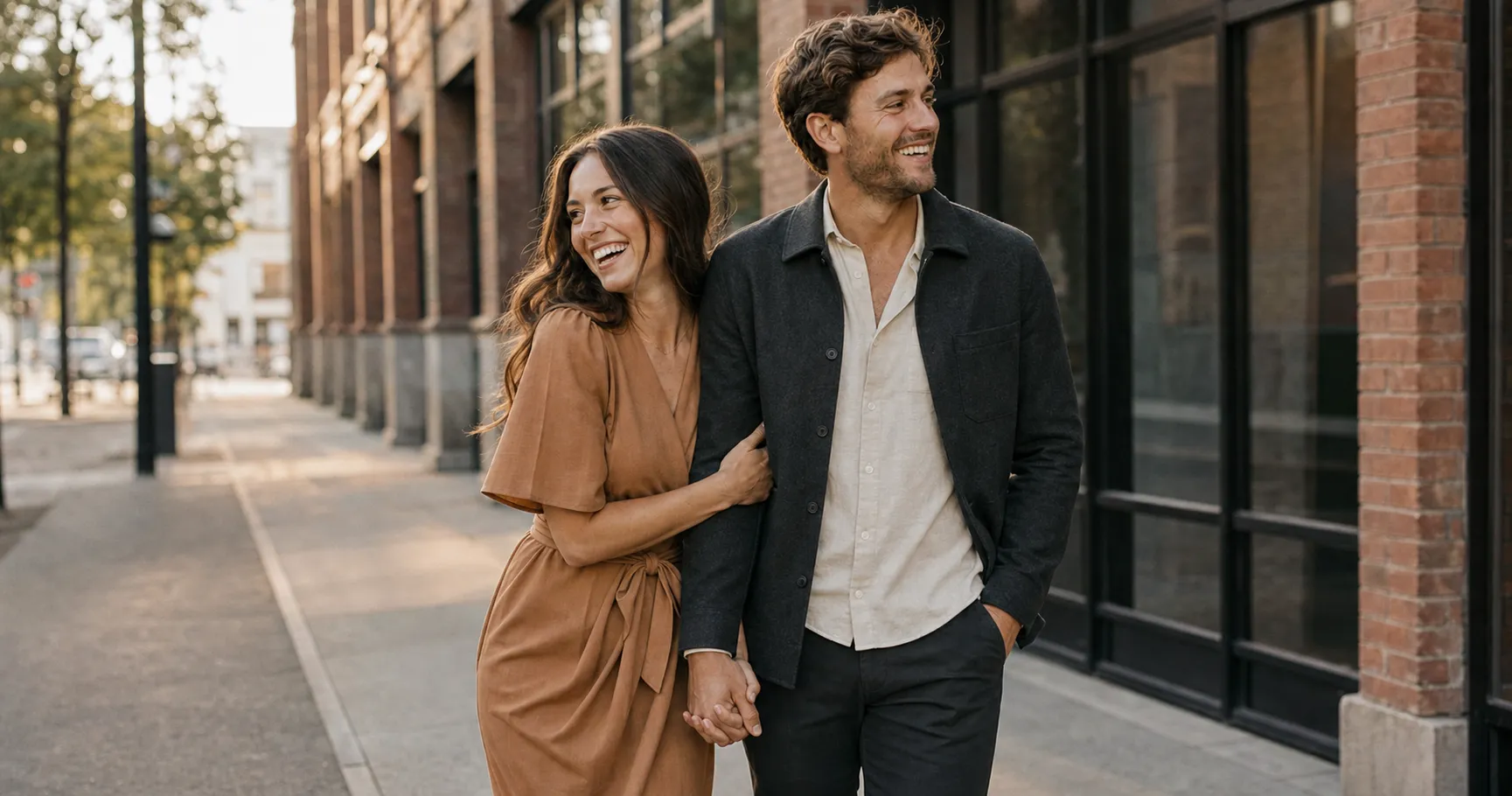
The most common mistake is treating “we should match” as the goal. It is the opposite of the goal. Matching is about sameness. Coordinating is about harmony. Two people in identical white shirts and identical jeans read as a uniform, or a team photo, and the eye notices the costume before it notices the couple.
This is close to unanimous advice from the people who shoot these for a living. Wedding-planning site The Knot, in its engagement-outfit guide, puts the rule first: coordinate with your partner, don’t match. The reason is simple. You almost certainly do not dress identically on a normal Tuesday, so dressing identically for the one set of photos meant to look like you sends the wrong signal.
Drag the slider. Same couple, same light, same field. The only thing that changes is whether they matched or coordinated, and it changes everything about how they read.
Why does this matter enough to plan around? Because these are not disposable photos. An engagement session runs about $200 to $1,000, with $500 a common average, according to vendor marketplace The Bash, and you walk away with 30 to 60 edited images that go on save-the-dates, the wedding site, and a frame on someone’s mantel. The outfit is the one variable you fully control, and it is the one people will see for years.
So before you open a single shopping tab, find out which part of this you actually need to fix.
30-second diagnostic
Where are you stuck?
Three quick questions, then we point you straight to the part of this guide you need.
What is actually stopping you right now?
Which sentence sounds most like you?
If you could fix one thing in five minutes?
Start With Your Colors
Most outfit panic is really color panic. Settle the palette first and the actual clothes get easy.
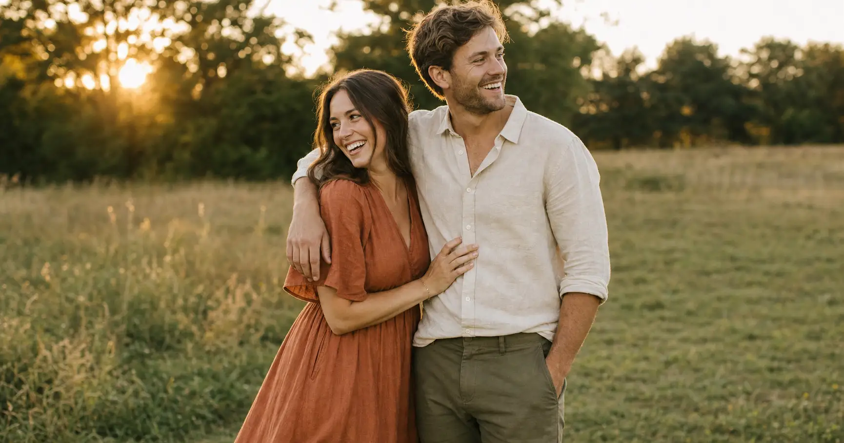
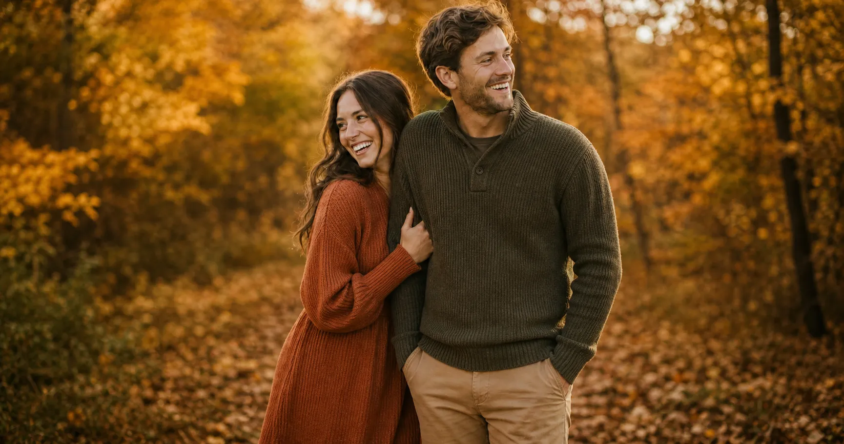
Pick two to four colors that live in one tone family, then split them between you. The Knot’s guide suggests building on neutrals with one soft tone or a single statement color. Staying in one family is what makes two different outfits feel like one photo. Cool tones are blue, green, purple, and gray. Warm tones are pink, orange, red, beige, and most earth tones. A warm rust dress next to cool slate trousers fights itself; a warm rust dress next to cream and olive does not.
Lead with what flatters the pickier dresser. If one of you looks tired in mustard or washed out in icy pastels, build the palette around the other end of the spectrum and let the easier-to-dress partner fall in line. Warm, muted, mid-depth colors are the safest starting point for most skin tones, but the full logic of which colors suit which complexion, and which to avoid, is its own subject, covered in our guide on what colors to wear in photos.
Build Both Outfits From One Palette
With the palette set, the build is three moves you can run in order.
Give each person a different lead color
You should not both wear the same dominant color. One of you leads, the other answers. AK Photography calls this the Statement and Anchor method: one person wears the focal piece, often a pattern, and the other pulls solid colors out of it. If her dress has sage in it, his shirt is sage. One way to wear it:
| Person | Dominant color | Pulls in (palette accents) | Texture |
|---|---|---|---|
| Partner A | Blush (flowy dress) | Soft blue + nude | Flowy / soft drape |
| Partner B | Navy (coat) + gray trousers | A blush pocket square | Structured / tailored |
One shared palette, two dominant colors: each partner leads with a different color from the same family, then pulls in the others.
Add texture so solids don’t go flat
Solid colors can look thin on camera. Texture fixes that. Linen, knit, denim, suede, and lace add weight and depth without adding a busy pattern. A smooth dress next to a textured jacket reads richer than two flat surfaces.
Layer for depth, not bulk
A cardigan, an open jacket, a wrap, or rolled sleeves give the eye something to travel and add a vertical line that lengthens you. Layers also buy you on-the-day options if the light or the temperature turns.
One paste-ready AI move a week, the kind you can use on a Tuesday or a Sunday. Subscribe to the newsletter and the Independent Brand Visual Kit, a set of copy-ready photo prompts, is yours free: join here.
If you want a low-stakes dry run before the day, you can turn one selfie into a full AI photoshoot and get a feel for your angles, your colors, and what reads well on camera before the real session.
What the Camera Punishes
Some clothes look fine in the mirror and fall apart in the photo. The mirror shows you the color. The camera shows you the color plus the light bouncing off it, plus the limits of the sensor. Five things lose that fight.
The white one surprises people, so it is worth the detail. Canon’s own guide to dynamic range explains that a sensor can only hold so much range between bright and dark, and a blown-out highlight is gone for good: there is no detail left to recover. Bright white reflects light straight back into the lens and clips first, which is why a crisp white shirt becomes a flat white shape. Cream and ivory give you the same light feel without the blowout.
The color-cast problem is just as real. As Fstoppers points out, a saturated top throws its own color onto your skin and leaves a cast on the face that reads unnatural and pulls focus off your expressions. And tight repeating patterns shimmer: Photography Life explains that fine stripes and small checks interfere with the sensor’s pixel grid to create moiré, and it shows up more now that many cameras have dropped the filter that used to soften it.
Dress for Where You’re Standing
The same palette has to answer the place. Your outfits should work with the location, not fight it. A field of green grass is a worked example of why. Fstoppers notes that grass bounces a green cast up onto skin in midday sun, so green or turquoise outfits there make you look slightly ill. In a desert or a pale stone setting, a darker outfit adds the contrast the scene is missing.
Match the register, too. A beach or meadow wants soft, flowing, earthy. A city block wants cleaner lines and structure. And keep your two formality levels aligned with each other: if one of you is in a gown and the other in a t-shirt, you look like you arrived at different events. When in doubt, both land on elevated casual. Here is the same idea as a quick reference:
| Location | Palette that pops | Formality | Watch out for |
|---|---|---|---|
| Beach / coast | Soft neutrals, sand, sky-blue | Relaxed, flowing | Stark white that blows out in bright sun |
| Field / meadow | Warm earth tones, rust, cream | Easy, elevated casual | Greens that blend into the grass |
| City / urban | Deeper tones, charcoal, camel | Cleaner lines, structured | Busy patterns against busy backdrops |
| Forest / greenery | Warm or jewel tones, burgundy, gold | Cozy to dressy | Green and turquoise that disappear |
| Studio / indoor | One or two clean colors | Whatever you choose | Pure white on a white backdrop |
Season is a dial on the same palette, not a new one: reach for warmer earth tones in fall and deeper jewel tones in winter, but keep the two-to-four-color logic intact.
None of this changes once you leave the closet. It only gets tuned to the place.
FAQ
Q: Do I have to wear white for engagement photos?
A: No. White is optional, and on camera it is often the harder choice. Bright white reflects light back and clips to a flat patch before anything else in the frame, and a blown highlight can’t be recovered, per Canon’s dynamic-range guidance. If you love the light, airy look, wear cream or ivory instead. You get the softness without the blowout.
Q: Is it okay to wear black for engagement photos?
A: Yes, with one caution. Black works beautifully for contrast, like a dark outfit in a pale desert or stone setting. The trap is head-to-toe black standing next to bright white, which pushes the scene to two extremes the sensor can’t hold at once, and the black loses its shape. Pair black with mid-tones, or share a palette across both of you.
Q: What is the best color to wear for engagement photos?
A: There is no single best color; the best color is the one that suits your skin and your location and sits in the same family as your partner’s. Soft, muted tones and warm neutrals photograph reliably well. The full logic, including colors to avoid by skin tone, is in our guide on what colors to wear in photos.
Q: What should I avoid wearing for engagement pics?
A: Five things: pure bright white, neon or hot-saturated colors, tight fine patterns like pinstripes or small checks, clothing with big logos or text, and head-to-toe black next to white. Each either blows out, casts color on your skin, shimmers on camera, or pulls the eye off your faces.
Q: How do I look skinny in engagement photos?
A: More of it is fit and posing than color, but a few wardrobe moves help: choose pieces that fit cleanly rather than cling or tent, lean on darker or mid-tone solids over busy patterns, and add a vertical line like an open jacket or a long cardigan. For the posing half of the answer, see how to be photogenic.
Key Takeaways
- Coordinate, don’t match. Matching reads as a costume; one shared palette worn two ways reads as a couple.
- Settle color first: a 2 to 4 color palette in one tone family, with each person leading a different color.
- Skip the five the camera punishes: pure white, neon, tight fine patterns, big logos, and head-to-toe black.
- Dress for the location and keep your two formality levels aligned with each other.
- The outfit is the one variable you fully control in photos you’ll see for years.
One Last Check Before the Shoot
Lay both outfits next to each other on the bed. Look at them the way the camera will, not the way the mirror does. Are these two outfits coordinating, or are they just matching? Are they pulling from one palette, or two? Is anything in the pile pure white, neon, or finely striped?
And if you want to see yourself camera-ready before the day, turn one selfie into an AI photoshoot and preview how a coordinated, well-lit version of you comes together. If your shoot is a different occasion, the same rules adapt: our guide on what to wear for pictures has the by-occasion version.