You can wear the perfect outfit, in the perfect fit, for the perfect occasion, and still look tired and washed out in the photo. The reason is almost never the cut. It is the color sitting next to your face, fighting your skin instead of flattering it. Color is its own decision, made before the occasion, before the palette, before anything else. Get your undertone right and the rest of the wardrobe falls in line.
Find Your Undertone First
Here is the thing most people get backward. They pick a color they like, then wonder why it looks great on a friend and dull on them. The color did not change. The skin under it did.
The deciding factor is your undertone: the cool, warm, or neutral tinge sitting underneath the surface of your skin. As the styling service Stitch Fix explains, your surface tone shifts with the seasons but your undertone stays fixed, even when a summer tan darkens what you see in the mirror. That is why undertone, not the visible shade, is the thing worth pinning down first. It is also the thing you can settle in about two minutes, with three tests that need nothing but daylight.
The vein test. Turn your wrist over and look at the veins in good natural light. Green-looking veins point to a warm undertone. Blue or purple veins point to cool. If you genuinely cannot tell, you are likely neutral.
The white-versus-cream test. Hold a pure white shirt next to your bare face, then swap it for a cream or ivory one. Stitch Fix notes that warm skin reads slightly yellow against pure white and looks healthier against cream, while cool skin reads pink or rosy against white and prefers it to cream.
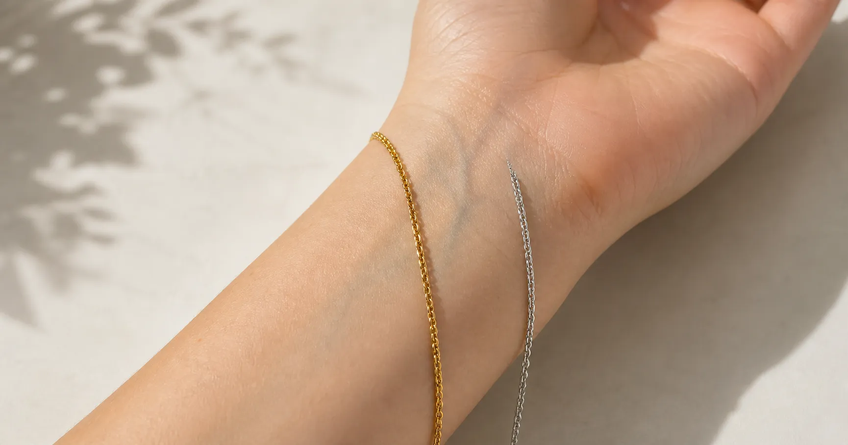
The gold-versus-silver test. Hold gold jewelry to your face, then silver. The metal that makes your skin look brighter and more even is the giveaway. Gold flatters warm undertones, silver flatters cool ones, and if both look fine you are neutral.
Run all three. When two of them agree, you have your answer. That answer is the input to everything below.
The Best Colors for Your Skin Tone
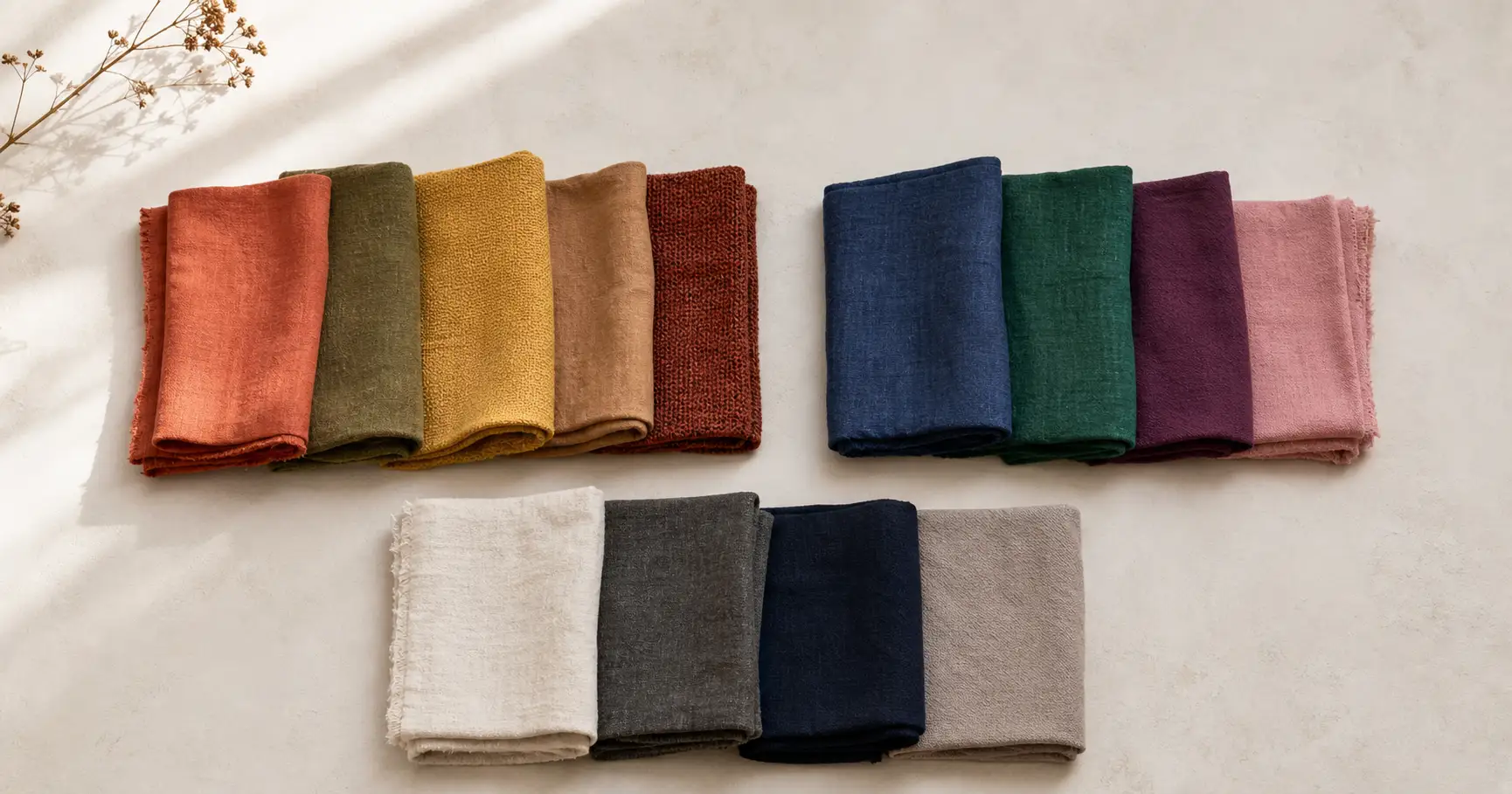
This is the part worth bookmarking. Once you know your undertone, the colors stop being a guess and become a lookup. The table below maps each undertone, at a fair and a deep skin depth, to the colors that flatter and the ones to approach carefully. The undertone decides the family; your skin depth only tunes how bright or how deep you can push before a color overwhelms or disappears against you.
| Undertone and depth | How to spot it | Colors that flatter | Colors to go easy on |
|---|---|---|---|
| Warm, fair | Green wrist veins; gold suits you; skin reads yellow next to white | Soft terracotta, sage, camel, warm coral, peach, cream, warm ivory | Icy pastels and ice blue, which can wash you out |
| Warm, deep | Green wrist veins; gold suits you; skin tans easily and rarely burns | Mustard, rust, olive, warm red, brick, bronze, golden yellow | Muddy browns and pale beige that sit too close to skin |
| Cool, fair | Blue or purple wrist veins; silver suits you; skin reads pink next to white | Cool pink, lavender, sky blue, soft emerald, navy, true white | Orange and yellow-green, which can add a sallow cast |
| Cool, deep | Blue or purple wrist veins; silver suits you; skin reads rosy or has a bluish tinge | Sapphire, cobalt, ruby, fuchsia, emerald, royal purple, crisp white | Muted earth tones and burnt orange, which can look flat |
| Neutral, any depth | Veins hard to read; both metals suit you; tests come back mixed | Soft, natural versions of most colors; jade, teal, blush, denim blue, taupe | Anything at full neon saturation, which overwhelms a balanced complexion |
A few colors flatter nearly everyone, which is why they fill so many galleries. Navy, teal, and charcoal sit far enough from skin to keep your face separated without fighting any undertone. Teal earns its place by splitting the difference: the blue in it stays cool and fresh while the green in it carries warmth, so it lands on most people. When you are unsure, lead with one of those three.
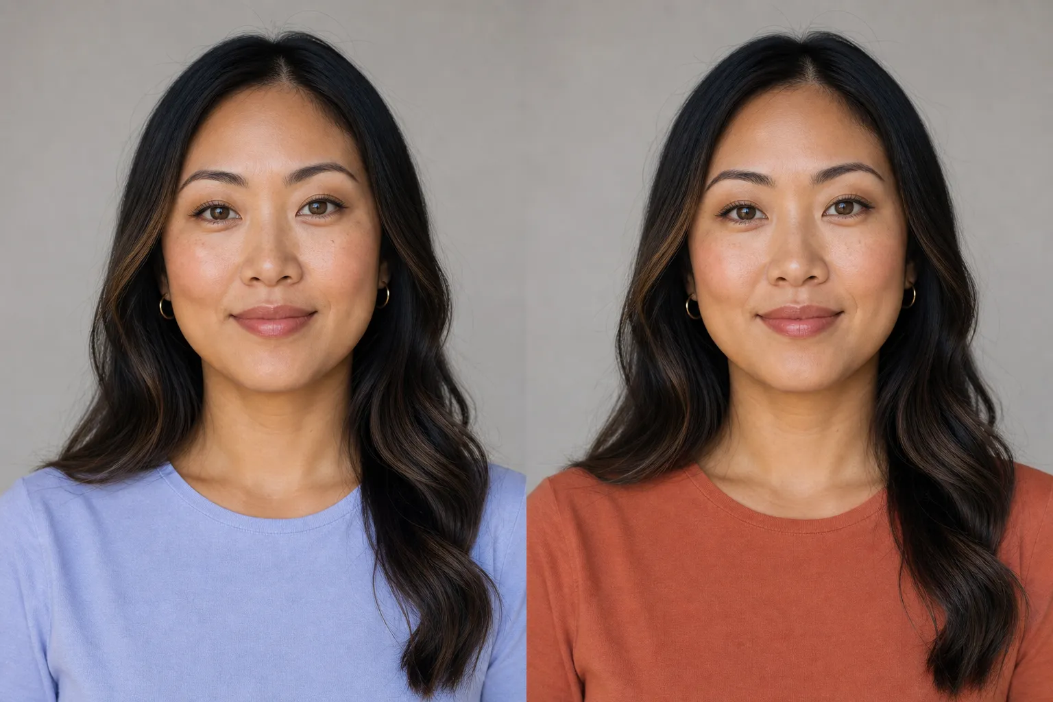
And when you love a color that does not love you back, there is a placement trick. Wear it below the waist. A shade that fights your undertone does the most damage near your face, so keep your flattering colors up top and let the rebel live in your trousers or skirt. The example below shows the difference one top color makes on the same person, same light, same everything else.
Colors the Camera Struggles With
Undertone tells you what flatters you. The camera still gets a veto, and it overrules everyone. A few colors fall apart in the photo for physics reasons, not taste. The mirror shows you the color. The camera shows you the color plus the light bouncing off it, plus the limits of the sensor.
Pure bright white is the one that surprises people. Canon’s guide to dynamic range explains that a sensor holds a narrower range of brightness than your eye, and once a bright area clips to pure white there is no detail left to recover. A crisp white shirt reflects light straight back and blows out to a flat patch first. Cream and ivory give you the same airy feel without the blowout.
Neon and highly saturated colors lose a different way. They bounce their own color onto your skin. Fstoppers, in a piece on how clothing reflects light, shows a yellow shirt leaving a noticeable cast on the subject’s face, and notes that fluorescent colors tend to look bad against skin. The muted or pastel version of the same color carries the mood without the cast.
The last trap is contrast, not a single color. Head-to-toe black standing next to bright white forces the scene to two extremes the sensor cannot hold at once, and the black loses its shape. Mid-tones fix it. These are the vetoes, and there are only a handful. Inside them, your undertone palette has all the room it needs.
Putting Colors Together
One flattering color is the start. A photo usually needs two or three working together, and the logic is simpler than it looks: stay inside one temperature family, and let one color lead.
Warm tones are the pinks, oranges, reds, beiges, and most earth tones. Cool tones are the blues, greens, purples, and grays. A warm rust top next to cool slate trousers fights itself; a warm rust top next to cream and olive sings. Pick two or three colors that share a temperature, give one of them the lead, and let the others support it. That is the whole game.
When other people are in the frame, the same rule scales up. Settle on one shared palette of two or three colors, then let each person lead with a different one of them. Sameness reads as a uniform. A shared palette reads as people who chose to be in a photo together. Lead the palette with whatever flatters the pickier complexion in the group, and let the easier-to-dress people fall in around it.
One paste-ready AI move a week, the kind you can use on a Tuesday or a Sunday. Subscribe to the newsletter and the Independent Brand Visual Kit, a set of copy-ready photo prompts, is yours free: join here.
Quick Notes by Occasion
Color is the through-line every shoot shares, which is why it lives here in one place instead of being re-solved each time. The occasion only tunes the same palette. A few quick notes:
- Engagement and couples. Two people, one shared palette, each leading a different color from it. The full couples logic, including matching versus coordinating, is in our guide on what to wear for engagement photos.
- Family pictures. More bodies, same palette discipline. Hand the busiest print to one person and keep everyone else in solids that pull a color out of it. See what to wear for family pictures for the group version.
- Maternity and senior portraits. Lean into the undertone-flattering colors and softer textures; these are close-up, face-forward sessions where the color nearest your face does the most work, covered in what to wear for maternity photos and what to wear for senior pictures.
- Any setting. The location throws light back at you, so a green field can cast green up onto skin in bright sun. Dress against the setting, not into it. The broader what to wear for pictures guide ties it together.
How you carry the color is a separate skill, covered in how to be photogenic. Color settles the wardrobe. Posture and expression do the rest.
If you want to see your colors on camera before the real shoot, you can turn one selfie into an AI photoshoot and watch how a coordinated, well-lit version of you comes together in different shades.
FAQ
Q: What colors are most flattering for photos?
A: The most flattering color is the one that agrees with your undertone. Warm undertones glow in earthy colors like terracotta, olive, mustard, warm red, and cream. Cool undertones come alive in jewel tones like sapphire, emerald, cool pink, and navy. Across both, navy, teal, and charcoal flatter nearly everyone because they sit far enough from skin to keep your face separated without fighting it.
Q: How do I find my undertone for choosing colors?
A: Three quick tests get you close. Look at the veins on your inner wrist in daylight: green-looking veins point to warm, blue or purple to cool, a mix to neutral. Hold a true white shirt next to a cream one against your bare face, and see which one your skin looks healthier against. Or check whether gold or silver jewelry suits you more. Gold reads warm, silver reads cool. Stitch Fix uses the vein and white-shirt tests, and notes that your undertone stays fixed even when a tan changes your surface tone.
Q: What colors should you not wear for a photo shoot?
A: Skip the few colors the camera fights for physics, not taste. Pure bright white clips to a blown-out patch the sensor cannot recover, per Canon’s dynamic-range guidance. Neon and highly saturated colors bounce their own color onto your skin, which Fstoppers shows leaves a visible cast on the face. And head-to-toe black next to bright white pushes the scene to two extremes the sensor cannot hold at once.
Q: What is the best color to wear for pictures?
A: There is no single best color. The best one suits your undertone and sits in a small palette with whoever else is in the frame. Soft, muted, mid-depth colors are the safest starting point for most people because they hold their shape on camera and do not cast color on skin. Start from your undertone, pick two or three colors in one temperature family, and skip the handful the camera fights.
Q: Does skin tone or undertone matter more for picking colors?
A: Undertone matters more. Your visible skin depth, light or deep, narrows how dark or bright a color can go before it overwhelms or disappears against you, but your undertone, warm or cool or neutral, decides whether a color flatters or fights you in the first place. A deep-skinned warm person and a fair-skinned warm person both glow in golden earth tones; they just dial the brightness differently.
Key Takeaways
- Find your undertone first. The vein test, white-versus-cream test, and gold-versus-silver test place you in about two minutes.
- Your undertone, not your visible skin depth, decides which colors flatter. Warm leads earthy, cool leads jewel-toned, depth only tunes the brightness.
- Navy, teal, and charcoal flatter nearly everyone.
- The camera vetoes a few colors regardless of who you are: pure white, neon, and head-to-toe black next to white.
- A color that fights your undertone hurts least worn below the waist, away from your face.
One Last Look Before You Pack
Hold each top up to your face in daylight, the way the camera will see it, not the way it looks folded in the drawer. Is the color nearest your face the one that agrees with your undertone? Do your two or three colors share a temperature? Is anything in the pile pure white or neon?
Get those three right and the gallery comes back the way you hoped. And if you want to test your colors before the day, turn one selfie into an AI photoshoot and preview how each shade reads on camera. To check one specific piece in a specific color, see the outfit on you before it ships.