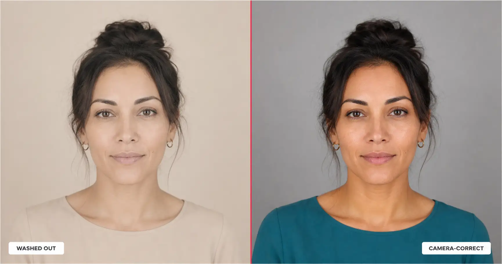
The best color for a professional headshot is the one that contrasts with both your skin tone and the wall behind you. Not your favorite color. Not the color a friend looks good in. A headshot lives or dies on separation: your face has to stand apart from your shirt, and your shirt has to stand apart from the background. Pick a color that loses either contest and the photo looks flat, and you usually cannot say why.
The contrast triangle
A photographer named one variable wrong and lost the shot. In a 2019 portrait sitting I watched, the subject had medium-warm skin, wore a pale beige sweater she loved, and sat against the studio’s default beige wall. The sweater flattered her in the mirror. On camera, her shoulders dissolved into the wall and her face went tired. Nothing was wrong with the light. The color had lost.
A headshot color decision has three legs, and they pull against each other. Your skin tone is one leg. Your wardrobe color is the second. Your background is the third. Call it the Contrast Triangle. The color you wear has to win against two of those three legs at once: it has to separate from your skin so your face reads, and it has to separate from your background so your shape reads. Tonal separation between subject and background is a first-principle of portrait lighting, the thing the New York headshot photographer Peter Hurley built his widely-published technique around, and it is the part a color choice can quietly hand you or quietly take away.
Most people optimize one leg and lose the photo:
- Pick a color that matches your skin tone closely and your face flattens. There is no edge where your jaw meets your collar.
- Pick a color that matches the wall behind you and your shoulders vanish. Your head floats with no body under it.
- Pick a color you simply like, ignoring both, and you get the most common headshot failure of all: a photo that looks “off” for a reason you cannot name.
The cost of guessing here is not small. A professional headshot studio session in the US runs roughly $300 to $1,200 for a single sitting, per published rates at studios like Capturely and the editorial-tier prices at The Light Committee in New York. A large part of that fee buys the wardrobe judgment: the photographer telling you, before you sit down, which color will survive the camera. That judgment is what this article hands you for free.
Look at the same failure and fix on one face.
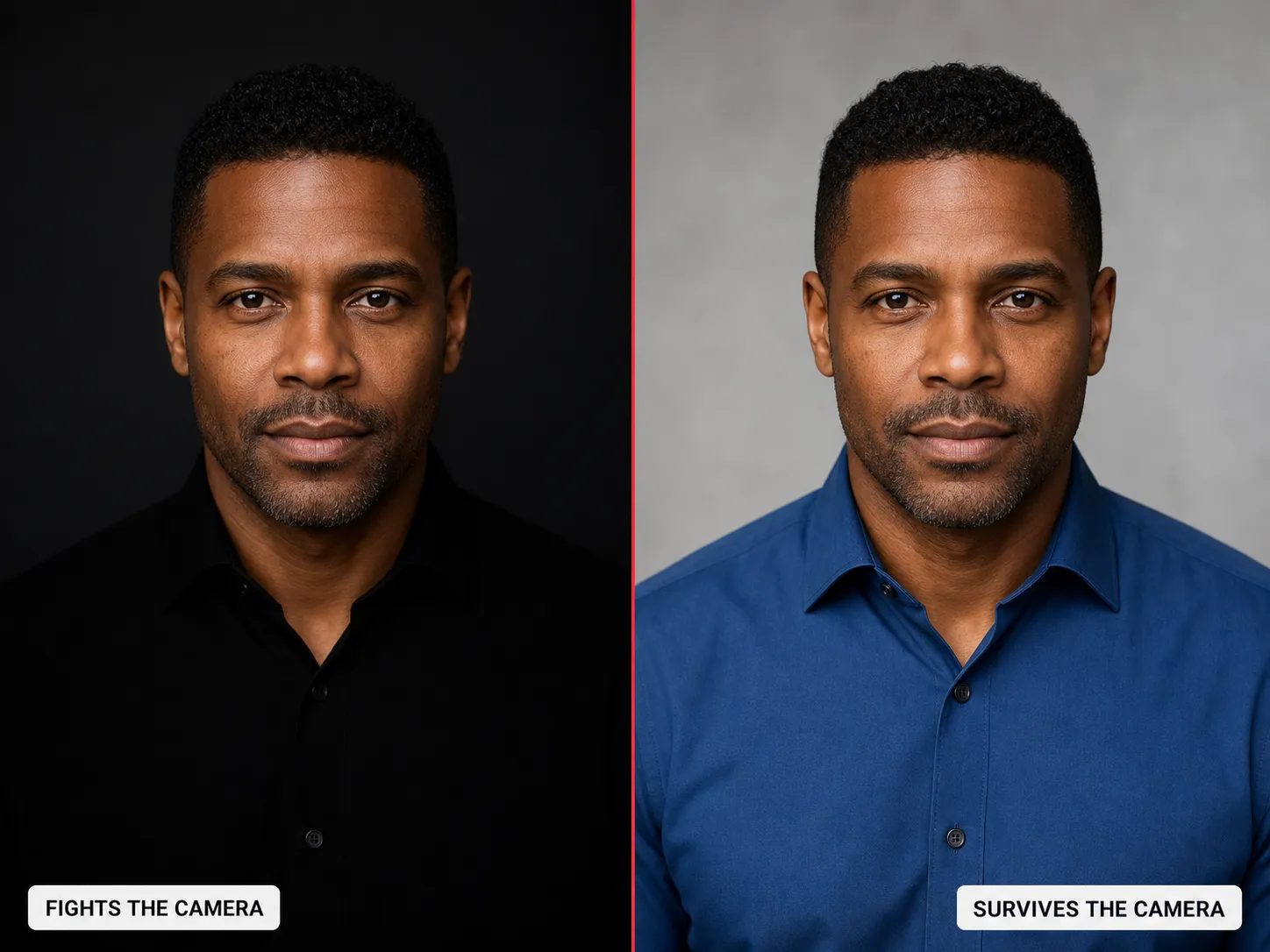
Which is why the next question is not “what is the best color.” It is “what is the best color for my skin tone, against my background.”
Best colors by skin tone
Skin tone sets the first leg of the triangle. The goal is contrast with your skin, not a match to it. A color that sits a clear distance from your skin’s value gives your face an edge to read against, which is what makes you look present instead of pale or flat. This is the same logic stylists borrow from seasonal color analysis, the system Carole Jackson popularized in her 1980 book Color Me Beautiful: the right color is the one whose value and undertone sit apart from your own, not the one that blends in.
The table below is the cheat-sheet. Find your skin-tone band, wear from the middle column, and the contrast against your face is handled.
| Your skin tone | Colors that photograph well | Why (the contrast reason) | Skip |
|---|---|---|---|
| Deep (deep brown to ebony) | Mid-blue, emerald, mustard-gold, warm white, ruby | High contrast against deep skin reads as vivid and dimensional; clean mid-to-bright tones keep separation without flattening detail | Pure black (merges with skin and shadow), murky browns |
| Medium-warm (golden, tan, warm olive-brown) | Teal, terracotta, forest green, deep coral, cream | Mid-saturation jewel and earth tones echo the warmth without competing; enough value contrast to lift the face | Neon brights (cast color onto skin), pale beige (washes out) |
| Olive (green-undertone, neutral-warm) | Burgundy, dusty rose, slate blue, charcoal, plum | Cool-leaning saturated tones counter the green undertone and bring out skin; muted-rich beats both pastel and neon here | Yellow-green, lime, bright orange (amplify the olive cast) |
| Light-warm (fair with golden or peach undertone) | Navy, teal, soft coral, warm gray, olive | Deeper or saturated colors add the value contrast a light face needs so the photo doesn’t read flat | Pale pastels (disappear into a fair face), pure white near the collar |
| Fair-cool (porcelain, pink or blue undertone) | Cool blue, emerald, soft plum, charcoal, true red | Cool saturated tones harmonize with cool undertones and give the face an anchor; clean contrast keeps you from looking pale | Beige, taupe, washed-out nudes (drain remaining color from the face) |
The pattern across every row is one rule. Mid-saturation colors win and extremes lose. A color saturated enough to read but not so loud it casts onto your skin will flatter almost any face. That is also why jewel tones (teal, emerald, burgundy, sapphire) show up again and again in professional-headshot wardrobe guidance. Capturely’s published what-to-wear advice for headshots converges on the same point: solid mid-to-deep colors over busy prints or extremes, every time, because they hold their color under studio light without bouncing a tint onto the skin.
One caution before you commit to the column. The skin-tone table tells you what flatters your face. It does not yet account for the wall behind you, and a color that wins against your skin can still lose against your background. That is the next section.
Colors to avoid, and the one reason each fails
Some colors fail no matter your skin tone, and they fail for a camera reason, not a taste reason. Knowing the reason is what lets you trust the rule instead of memorizing a list.
The thread tying all five together: each one fails because of how a camera renders light and value, not because the color is ugly. Pure white clips because the sensor runs out of headroom in the highlights. Black crushes because it runs out of detail in the shadows. Adobe’s published photography guidance describes both ends as the classic exposure trap, where the brightest and darkest patches lose all texture first. The moire problem is just as physical: Nikon’s own published guidance notes that fine repeating patterns can interfere with a sensor’s pixel grid and produce false shimmering color that is hard to remove after the fact. A mid-tone solid gives the sensor room to keep detail at both ends, which is the entire reason mid-tones photograph cleanly.
Delete these five and you have removed the photos that fail on the wardrobe leg. The background leg is what removes the photos that disappear.
Color versus background
Your wardrobe color is only half the contrast equation. The background is the other half, and the two have to be solved together.
This is where two different decisions get blurred, so here is the clean split. This article owns the color you wear. The companion piece on the professional headshot background owns the backdrop: which background color to shoot against and how to fix a bad one. Wardrobe color is the subject of the contrast triangle’s second leg. Background color is the third leg. You need both, but they are different jobs.
The matrix below maps the second leg against the third: which wardrobe color pops against which background, and which one vanishes.
| Background you’re shooting against | Wardrobe colors that pop | Wardrobe colors that vanish |
|---|---|---|
| Neutral mid-gray (the studio default) | Almost anything mid-saturation: teal, blue, burgundy, emerald, coral | Other grays, muted taupe (too close in value to the wall) |
| White or very light | Navy, charcoal, jewel tones, true red | White, cream, pale pastels (you melt into the wall) |
| Dark charcoal or near-black | Warm white, mid-blue, mustard, emerald | Black, deep navy, dark brown (shoulders disappear into the backdrop) |
| Warm-color painted wall (terracotta, sage, etc.) | A contrasting cool tone, or a clean neutral | Any color in the same family as the wall (the wall wins, you recede) |
| Office or outdoor soft-blur (bokeh) | Solid mid-tones with a clean edge | Busy patterns and colors that match the dominant blur color |
The rule under the matrix is short. Your top and your wall must differ in value. LinkedIn’s own profile-photo guidance recommends a plain, uncluttered background with head-and-shoulders framing and the face filling roughly 60 percent of the frame, which is exactly why the wardrobe color has to do the separating work: a quiet wall will not separate you on its own. If your wall is neutral mid-gray, the studio default, nearly any mid-saturation color from your skin-tone row will pop. If your wall is white, skip white. If your wall is dark, skip black. The trap to avoid is wearing a color in the same family as the wall, because then the wall wins and you recede into it.
Notes for women, men, and corporate
The color follows your skin tone, not your gender or your title. The rule does not change across these three cuts. The options do, slightly, so here is the specific note for each.
What color to wear for a headshot if you are a woman
Women have a wider saturated range that still reads as considered rather than loud. A jewel-toned blouse, a structured blazer in teal or burgundy, or a deep-coral shell all hold their color under studio light and give the face a strong edge. The one place to be careful is loudness: a single saturated color reads as taste, but a multi-color print reads as noise and fights the camera. Pick the one color your skin-tone row recommends and let it carry the photo.
What color to wear for a headshot if you are a man
Men get the most mileage from a clean mid-blue shirt or a soft-shoulder blazer in navy or charcoal over a mid-tone. Mid-blue is close to a default that works on most skin tones, which is why it shows up so often in the skin-tone table above. Skip the glossy black shirt and the stark white dress shirt buttoned to the collar: both are the camera failures from the section above, just worn formally.
What color to wear for a corporate headshot
The corporate default has moved. The old black-suit-and-white-shirt pairing reads as dated and shoots as harsh high-contrast on camera. Most finance and consulting firms relaxed their dress codes in the late 2010s: Goldman Sachs announced a firm-wide flexible-dress policy in 2019, following JPMorgan’s 2016 business-casual memo, both widely reported in the business press at the time. A mid-blue or charcoal worn open-collar now reads as current and credible. If your field allows one restrained accent color, a burgundy or a deep green works; if it does not, mid-blue is the closest thing to a universally safe corporate headshot color.
If you want the full by-job breakdown instead of the by-color one, the companion piece on LinkedIn headshot examples by job sorts the same wardrobe decision by archetype: finance, tech, creative, healthcare, sales, academic, and executive. That article is organized by what your job signals. This one is organized by what your skin tone and your background can carry. Different cut, same camera.
The one paste that bakes the color in
You can shoot this with a camera and the rules above. Or you can hand the whole contrast triangle to an AI image tool and let it solve all three legs at once.
The prompt below builds a professional headshot from one photo of you, with your skin tone’s winning color and clean background separation already locked in. You swap a single word: the color from your skin-tone row.
Show the full promptTap to expand
Paste this into your AI (ChatGPT, Claude, Gemini, or any image tool).
REQUIRED upload before pasting: one clear, well-lit front-facing photo of your face.
Then swap the single placeholder {WARDROBE_COLOR} for the color your skin tone won in the table above.
Generate this image:
A single photoreal 1:1 square professional head-and-shoulders headshot of the person from the uploaded reference image. Match their bone structure, eyes, nose, lips, proportions, and skin tone exactly so the subject is clearly recognizable. The subject sits or stands upright with relaxed shoulders, body angled barely off-axis to camera by about ten degrees, head centered slightly above the vertical midpoint, eyes meeting the camera directly with a calm, grounded, faintly smiling expression. They wear a {WARDROBE_COLOR} top in a clean, well-fitted modern cut. The backdrop is a soft neutral mid-gray studio surface that sits clearly apart in value from the wardrobe color, so the subject’s shoulders and face separate cleanly from the wall. Lighting is soft balanced front-light: a large soft key directly in front of the subject with a gentle fill, producing even illumination with only mild natural fall-off on the cheekbones. The subject occupies 60-70% of the vertical frame. Skin shows visible pores, fine micro-texture, and natural micro-asymmetry, with full dimensional detail preserved on deeper skin tones and catchlights in the eyes; no porcelain smoothing. Shot on a 50mm-equivalent lens at approximately f/4, modest shallow depth of field, the backdrop slightly out of focus but never competing. Single 1:1 square professional head-and-shoulders portrait, identity-locked to the uploaded reference, with clean tonal separation between the wardrobe color, the skin, and the background.
Rules the AI must follow:
- Aspect ratio 1:1 square head-and-shoulders portrait: strict, locked at the start and the end of the prompt
- Identity preservation is the highest-priority constraint: match the uploaded reference photo’s bone structure, eyes, nose, lips, proportions, and skin tone exactly; the subject must be unmistakably the same person
- The wardrobe color must contrast in value with the mid-gray backdrop so the subject separates cleanly from the wall; never let the top and the wall sit at the same tone
- Keep the color saturated enough to read but never neon: the color stays on the fabric and must not cast a tint onto the skin
- Lighting is soft balanced front-light only: a large soft key directly in front of the subject with a gentle fill; do not use a harsh directional key that crushes shadow detail
- Subject occupies 60-70% of the vertical frame: tight head-and-shoulders crop, never wider than mid-chest
- Realistic skin texture required: visible pores, fine micro-asymmetry, natural unevenness; no porcelain smoothing, no over-retouched beauty filter, no waxy plastic surface
- Preserve full dimensional detail and catchlights on deeper skin tones; never flatten or lighten the subject’s natural skin tone
- One human figure only: solo subject, no background people, no multi-exposure ghosts
- No text, captions, watermarks, logos, or readable signage anywhere in the frame
- Single image output: no contact sheet, no variant grid, no before/after split
- Output the image directly without explaining the prompt back
Replace these placeholders with your details:
{WARDROBE_COLOR}= mid-saturation teal
Bonus tips.
- Swap
{WARDROBE_COLOR}for the color your skin tone won in the table: deep skin reads vivid in mid-blue or emerald, medium-warm in teal or terracotta, olive in burgundy or slate blue, light-warm in navy or coral, fair-cool in cool blue or true red. - If your real shoot uses a white or dark wall instead of mid-gray, change the backdrop line to match your actual wall, then pick a wardrobe color from the background table so the two still contrast. The contrast rule matters more than the exact gray.
- Want the same face for a different platform crop? Re-render with the aspect line swapped at the start and the end of the prompt and leave everything else identical.
The prompt does one thing the wardrobe rule cannot do on its own: it forces visible pores and natural skin texture and forbids the porcelain look by name. AI headshots default to a waxy, airbrushed surface, and the only way to defeat that default is to write the words into the rules. The mechanism behind why AI images look fake is covered in the anti-plastic AI image method, so this prompt does not re-explain it. It just carries the fix, the same way the identity-lock instruction carries your face from the first line.
The result drops straight into a LinkedIn profile, a company directory, or a speaker card, in a color you already know survives the camera.
FAQ
Q: What color should you wear for a professional headshot?
A: The best color is the one that contrasts with both your skin tone and the background you are shooting against. Mid-saturation colors win across almost every skin tone: teal, blue, burgundy, emerald, and deep coral photograph well because they sit far enough from skin and from a neutral backdrop to keep your face separated and present. Match the color to your skin tone first, then check it against your wall. Deep skin reads vivid in mid-blue or emerald, medium-warm skin in teal or terracotta, olive skin in burgundy or slate blue, light-warm skin in navy or coral, and fair-cool skin in cool blue or true red.
Q: What colors should you avoid in a headshot?
A: Avoid five colors for camera reasons, not taste reasons. Pure bright white clips to a blown-out highlight near the collar and pulls focus off your face. Glossy pure black crushes shadow detail and merges your shoulders into a dark wall. Neon and electric brights bounce their own color onto your skin and make you look unwell. Beige, taupe, and washed-out nudes sit at the same value as both skin and most backdrops, so you blend into both at once. Tight patterns and fine stripes produce a shimmering moire the camera sensor cannot resolve cleanly. Solid mid-tones avoid all five.
Q: What color to wear for a headshot if you are a woman or a man?
A: The rule is the same for both, and the color follows your skin tone, not your gender. Women have more saturated options that read as considered rather than loud: jewel-toned blouses, a structured blazer in teal or burgundy, a deep coral shell. Men get the most out of a mid-blue shirt or a soft-shoulder blazer in navy or charcoal over a clean mid-tone. Both should skip pure white at the collar and glossy black, and both should pick the color that contrasts their own skin and their own background.
Q: What is the best color to wear for a corporate headshot?
A: For a corporate headshot, the safe modern default is a mid-blue or charcoal worn open-collar, not the old black-suit-white-shirt cliche. Most finance and consulting firms relaxed their dress codes in the late 2010s, so a clean mid-tone reads as current and credible while a stark black-and-white pairing reads as dated and high-contrast on camera. Add one restrained accent color if your field allows it. The mid-blue is the closest thing to a universally safe corporate headshot color.
Key Takeaways
- There is no universal best color. The winner is set by the contrast triangle: your skin tone, your wardrobe, and your background. A color has to separate from two of the three at once.
- Match the color to your skin tone first, then check it against your wall. Mid-saturation jewel tones (teal, blue, emerald, burgundy, deep coral) win across almost every skin tone because they hold their color without casting onto your skin.
- Five colors fail for camera reasons: pure white clips, glossy black crushes, neon casts, beige washes out, tight patterns moire. Solid mid-tones avoid all five.
- The corporate default has moved to mid-blue or charcoal worn open-collar, not the dated black-suit-white-shirt pairing, after most firms relaxed dress codes in the late 2010s.
The shot you do not have to retake
Go back to the woman in the beige sweater against the beige wall. Same light, same face, same camera. Put her in a mid-saturation teal against a neutral mid-gray, and the photo she could not name a problem with simply works. The color was never about what she liked. It was about what the camera kept.
So before your next headshot, run the triangle. What does your skin tone want? What will it do against your wall? Which one color wins both? Pick that, and you get the headshot you do not have to retake. The full set of career-photo prompts, including the color-aware headshot prompt above, lives in the Image Prompt Pack for $19.