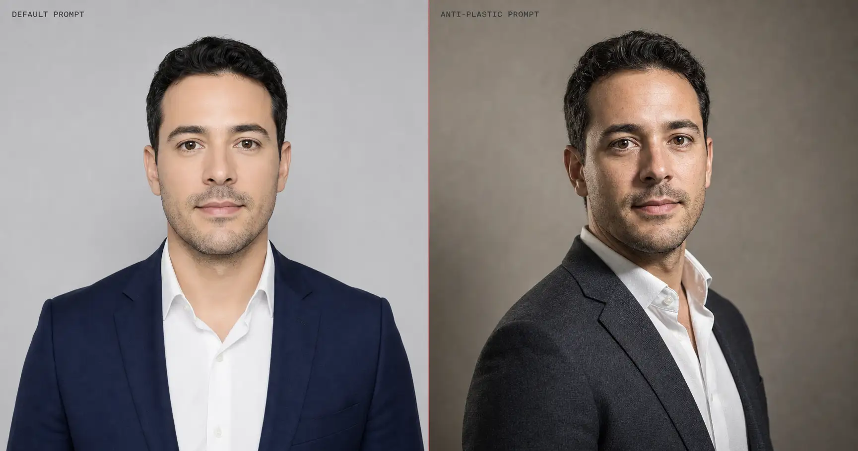
You typed a prompt into ChatGPT, Midjourney, or Nano Banana Pro, hit generate, and the face came back porcelain-smooth, lit from a single flat front-light, centered front-facing, wearing a generic blazer against a clean grey backdrop. It looked AI-generated at first glance. In 2026 this is the same five-symptom fingerprint across every leading model, and the fix is structural: across 125 production prompts we shipped this year, the same five language tactics flip the output from default to production-grade.
The default-output trap
Every leading image model in 2026 (GPT-Image-2, Nano Banana Pro / Gemini 3 Pro Image, Midjourney v8.1, Flux 2 Pro) converges on the same five-symptom default when the prompt language is vague. Porcelain skin. Symmetric composition. Flat front-light. Generic professional attire. A clean studio background. The reason most readers can name the symptom but not the cause is that the symptom is structural, not random: the model returns the statistical mean of its training distribution, and that distribution was dominated by stock-photo libraries, agency headshot reels, and portrait-marketplace SKUs in which airbrushed-skin retouching had already won the editorial battle a decade earlier.
That mean is what looks “AI” to a viewer. A naked human eye is calibrated against decades of photographed faces with real skin, real shadows, real wardrobe, real rooms. When the model averages all of that into the smoothest, most front-lit, most centered, most generic possible composition, what comes out is recognizable on sight as “the AI default.” Every counter-tactic in this article is a rewrite that pulls the prompt language away from that mean. Not by writing more, but by writing more concretely at the right token positions.
How we tested across 125 production prompts
The corpus behind this article is the 125-prompt library underpinning our image prompts pack. Twenty-five use-case subcategories: professional headshots, founder portraits, dating-app candids, Etsy product flat-lays, holiday cards, wedding invitations, social-media banners, Pinterest pins, pet portraits, and the rest. Every prompt ships with a paired reference image and was authored against the same eight ironclad rules: single-paragraph prose, identity-lock first, concrete material descriptors, aspect ratio + identity + format type at both start and end of the body, no negative phrasing in the prose, explicit micro-imperfection, technical photography parameters, and compositional fractions.
Both the “wrong” and “right” examples shown below were rendered on GPT-Image-2, currently the #1-ranked image model on LMArena as of May 2026. OpenAI shipped GPT-Image-2 on April 21, 2026 as the third-generation flagship image model, with reasoning-first generation and ~99% character-level text rendering accuracy per the release notes. Same model, same reference face, same render settings. The only variable that changes between each pair is the prompt language.
Tactic 1. Skin: micro-imperfection beats “good skin”
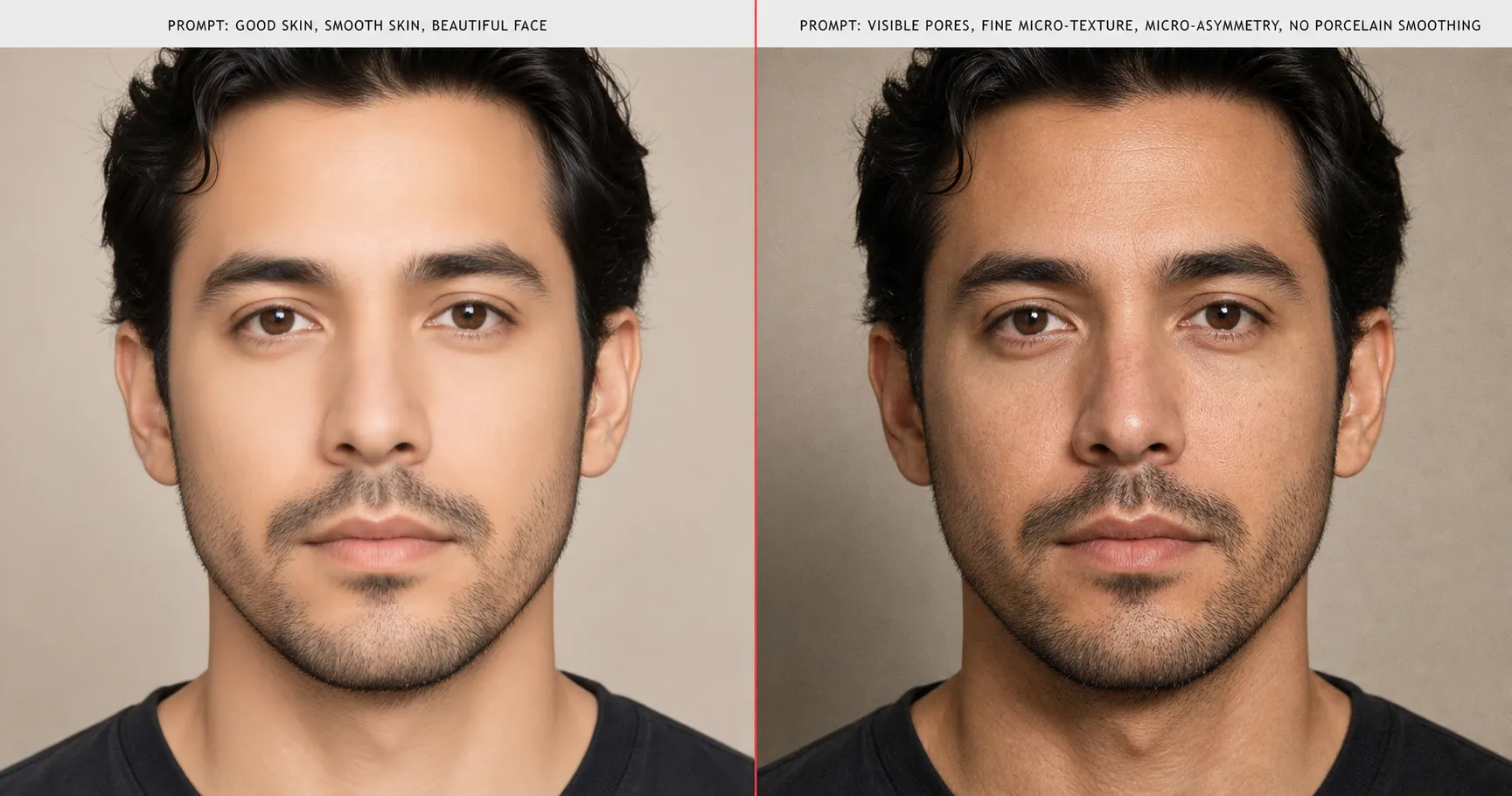
The most visceral failure mode is porcelain skin. Across every major image model (GPT-Image-2, Nano Banana Pro, Midjourney v8.1, Flux 2 Pro), the prompt phrasing “good skin,” “smooth skin,” or “beautiful face” produces an airbrushed, waxy, doll-smooth face with no pores, no asymmetry, and no texture. Reddit threads call it “AI plastic”; the editorial term for it is the porcelain skin default, and it is the single fastest tell that an image was AI-generated.
The fix is the micro-imperfection trio: visible pores, micro-asymmetry, fine micro-texture, and no porcelain smoothing, written into the prose body of the prompt as a literal substring, not paraphrased.
visible pores, fine micro-texture, micro-asymmetry, no porcelain smoothing
Full pack-level prompt — Tactic 1, Skin (swap the persona for your own subject):
Generate this image:

A 1200x630 16:9 cinematic editorial portrait of a 52-year-old founder, head-and-shoulders crop, three-quarter angle with body subtly turned camera-left, subject 55% of frame, head at 1/7 frame height, identity locked across the prompt: long oval face, deep-set hazel eyes spaced wide, prominent brow with a single faint scar through the left eyebrow, salt-and-pepper close-cropped hair with a sharp natural hairline, defined cheekbones, light olive Mediterranean skin tone. The skin treatment is the focal demonstration: visible pores, fine micro-texture, micro-asymmetry, no porcelain smoothing, faint 35mm film grain, light forehead lines and crow's-feet that read as real photographed skin rather than retouched stock. Directional cinematic key light from upper-left at 45 degrees, soft cool fill on the shadow side at one-third stop below key, sharp catchlight in both eyes. Charcoal merino crewneck under a slate-grey lightweight technical shell, no logos, no patterns. Warm-grey paper backdrop with a soft vertical gradient, gentle separation between subject and surface. Editorial founder-portrait register, Inc. magazine cover quality, not LinkedIn stock headshot. Output: single photoreal 1200x630 16:9 horizontal cinematic editorial portrait, identity-locked subject, photographic output format.

Rules the AI must follow:
- Aspect ratio 16:9 horizontal cinematic editorial portrait
- Identity preservation is the highest-priority constraint
- Skin must read as real human skin per the micro-imperfection clause in the prompt body
- One human figure
- No text, captions, watermarks, logos, or readable signage
- Single photoreal image output
- Output the image directly without explaining the prompt back
The phrasing works because it gives the model four concrete texture targets to hit, instead of one vague adjective to interpret. Vague adjectives get averaged toward the training-distribution mean; concrete textures push the output toward the specific look you named. The same face, the same model, the same render settings: only the language differs between the two halves of the figure above. For the underlying mechanism (why porcelain dominates the training distribution across every model in the field, and why a four-word phrase reliably overrides it), see the deep dive on AI plastic skin and the porcelain default.
Tactic 2. Light: directional beats “good lighting”
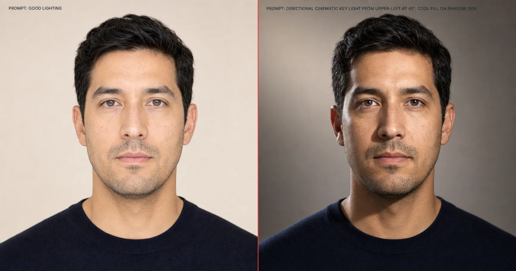
“Good lighting” is the second-most-common failure phrase in vague prompts, and it produces the second-most-common AI tell: a flat, evenly distributed frontal wash that erases facial topography and reads as a passport-photo lighting setup. The model’s default for “good” is “even,” because even is the safest average across portrait stock.
The counter-tactic is a directional light specification with motivated direction and motivated fill: directional cinematic key light from upper-left at 45°, cool fill on shadow side. Again, dropped into the prose body verbatim.
directional cinematic key light from upper-left at 45°, cool fill on shadow side
Full pack-level prompt — Tactic 2, Light (swap the persona for your own subject):
Generate this image:

A 1200x630 16:9 cinematic editorial portrait of a 38-year-old creative director, head-and-shoulders crop, three-quarter angle with body subtly turned camera-right, subject 55% of frame, head at 1/6 frame height, identity locked: heart-shaped face with a sharp jawline, large amber-brown eyes spaced standard with a subtle upturn at the outer corners, defined dark brows, shoulder-length chestnut hair with a deep side part falling over the right brow, warm medium-tan complexion, single small beauty mark above the left cheekbone. The lighting is the focal demonstration: directional cinematic key light from upper-left at 45 degrees with a hard-edged motivated falloff, cool fill on the shadow side at one-third stop below key, a defined editorial shadow shape under the jaw and across the right side of the neck, sharp catchlight in both eyes, no rim, no bounce from behind, single-source directional drama of the kind a Vanity Fair photographer chooses on the day. Skin reads as real photographed human skin: visible pores, fine micro-texture, micro-asymmetry, no porcelain smoothing. Cream silk blouse with single-button cuff under a structured camel wool blazer with visible weave. Deep mahogany wood-panel backdrop, gentle natural separation. Output: single photoreal 1200x630 16:9 horizontal cinematic editorial portrait, identity-locked, photographic output format.

Rules the AI must follow:
- Aspect ratio 16:9 horizontal cinematic editorial portrait
- Identity preservation is the highest-priority constraint
- Lighting must read as motivated single-source directional, not a flat front-wash
- One human figure
- No text, captions, watermarks, logos, or readable signage
- Single photoreal image output
- Output the image directly without explaining the prompt back
Specifying the angle (45° from upper-left), the source character (cinematic key), and the fill behavior (cool, on shadow side) gives the model three lighting parameters to solve for instead of one adjective to average. The result on the same face is a defined editorial shadow shape under the jaw, visible catchlight in the eyes, and the kind of lighting topography a human portrait photographer would have produced on the day. “Good” was the adjective doing the wrong work; the rewrite move replaces it with three technical parameters that the model can render unambiguously. For the broader pattern this tactic instantiates, see the closing section below and the concrete-beats-adjective rule.
Tactic 3. Composition: technical fractions beat “flattering”
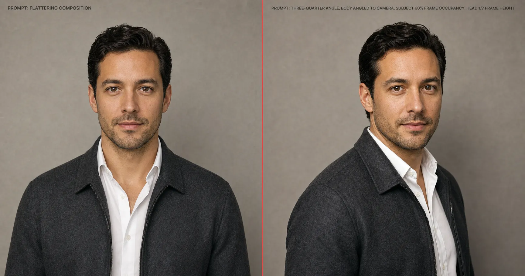
“Flattering composition,” “well-framed,” and “professional composition” all produce the same output: a dead-centered, front-facing mid-shot with the body squared to the camera and the head occupying a generic mid-portion of the frame. The model interprets every flattering-adjective as a directive to converge on stock-headshot composition, because that is what most labeled portrait stock looks like.
The counter-tactic is composition by fraction: three-quarter angle, body angled to camera, subject 50-70% of frame, head 1/7 of frame height.
three-quarter angle, body angled to camera, subject 50-70% of frame, head 1/7 of frame height
Full pack-level prompt — Tactic 3, Composition (swap the persona for your own subject):
Generate this image:

A 1200x630 16:9 cinematic editorial portrait of a 30-year-old startup founder. Composition is the focal demonstration: three-quarter angle with the body angled exactly 30 degrees from camera, subject occupying 60% of the frame, head positioned at 1/7 of frame height with the eye line landing on the upper-third horizontal, chin pointed slightly past the lens axis, left shoulder closer to camera and dropped just below the right, full upper torso visible from mid-bicep up. Identity locked across the prompt: square-set face with strong defined jaw, almond-shaped dark brown eyes spaced wide, thick dark brows, short black hair with a tousled forward-fall fringe, light wheat skin tone with subtle warmth, neat dark stubble along the jawline. Skin baseline-real: visible pores, fine micro-texture, micro-asymmetry, no porcelain smoothing. Lighting: directional cinematic key from upper-left at 45 degrees, cool fill on the shadow side, sharp catchlight in both eyes. Charcoal heavyweight cotton crewneck under a lived-in black canvas jacket with the collar open. Warm-grey paper backdrop with a soft vertical gradient. Editorial founder register, Fast Company cover quality, not stock-headshot. Output: single photoreal 1200x630 16:9 horizontal cinematic editorial portrait, identity-locked, three-quarter compositional framing, photographic output format.

Rules the AI must follow:
- Aspect ratio 16:9 horizontal cinematic editorial portrait
- Identity preservation is the highest-priority constraint
- Composition must use the explicit fractions in the prompt body, not center the subject front-facing
- One human figure
- No text, captions, watermarks, logos, or readable signage
- Single photoreal image output
- Output the image directly without explaining the prompt back
Fractions are the most adjective-resistant of the five tactics, because a number does not get averaged into a stock default the way “flattering” does. “Three-quarter angle” tells the model to rotate the body about thirty degrees; “subject 50-70% of frame” tells it where to crop; “head 1/7 of frame height” tells it where the eye line lands. The output of the same face under the same lighting is a deliberately framed editorial portrait instead of a centered passport. For the broader rule, see concrete-beats-adjective.
One paste-ready AI move a week. The kind of tactical rewrite above, applied to a different prompt, sent every Sunday. Subscribe to the newsletter for the weekly hack and the rotating starter pack of paste-ready prompts.
Tactic 4. Attire: material-specific beats “professional”
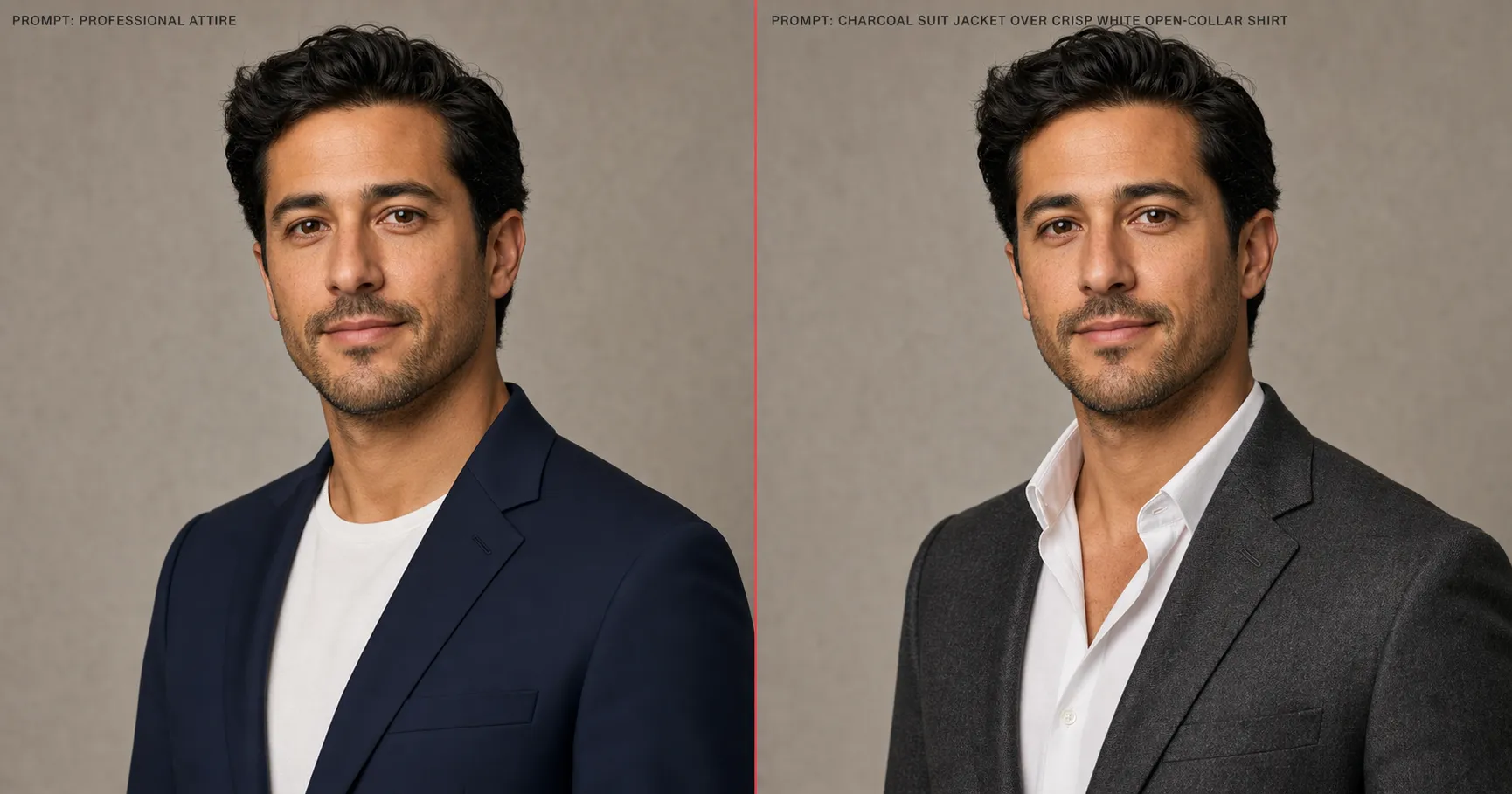
“Professional attire” produces the LinkedIn-default navy blazer on every face the model has ever been asked to render, because that is what “professional” averages to across the headshot training distribution. The garment reads as soft-edged AI confection, with no visible weave, no specific cut, and no material weight. Worse, vague wardrobe phrasing gives the model latitude to drift on identity: fabric and color choices propagate upward into face geometry when the prompt is loose enough.
The counter-tactic is material + garment + color, named explicitly: charcoal suit jacket over crisp white open-collar shirt.
charcoal suit jacket over crisp white open-collar shirt
Full pack-level prompt — Tactic 4, Attire (swap the persona for your own subject):
Generate this image:

A 1200x630 16:9 cinematic editorial portrait of a 45-year-old creative consultant, head-and-shoulders to mid-torso crop, three-quarter angle with the body subtly turned camera-left, subject 55% of frame, head at 1/7 frame height. Identity locked: oval face with high cheekbones, deep brown almond eyes spaced standard with subtle laugh lines at the outer corners, defined naturally-arched dark brows, jaw-length warm-black bob with a sharp inverted cut, deep warm-brown skin tone, faint visible freckling across the bridge of the nose. The wardrobe is the focal demonstration: material-layered specificity that reads as photographed clothing not AI confection. A cream linen blazer with visible weave structure and natural creasing at the elbow over a soft chambray button-up with the top two buttons open and the collar slightly askew, the chambray's blue-grey thread visible in close detail, a single thin gold chain at the collarbone with a small flat pendant resting flat against the chambray, no other jewelry, no logos, no patterns beyond the chambray weave. Skin baseline-real: visible pores, fine micro-texture, micro-asymmetry, no porcelain smoothing. Lighting: directional cinematic key from upper-left at 45 degrees, cool fill on the shadow side. Warm-grey paper backdrop with soft vertical gradient. Output: single photoreal 1200x630 16:9 horizontal cinematic editorial portrait, identity-locked, photographic output format.

Rules the AI must follow:
- Aspect ratio 16:9 horizontal cinematic editorial portrait
- Identity preservation is the highest-priority constraint
- Wardrobe must read as named photographed garments per the material-color-cut clauses in the prompt body
- One human figure
- No text, captions, watermarks, logos, or readable signage
- Single photoreal image output
- Output the image directly without explaining the prompt back
Material-specific phrasing locks two failure modes at once. It defeats the navy-blazer default because the model now has a specific weave and specific cut to render. And it protects identity, because the more wardrobe constraint you supply, the less room the model has to reinterpret face geometry to match a generic “professional” archetype. Swap the colors and the materials per persona (“cream linen blazer over a soft chambray shirt,” “black turtleneck under a charcoal wool overcoat”), but keep the structure: material, garment, color, layered as a phrase.
Tactic 5. Background: named scene beats “clean background”
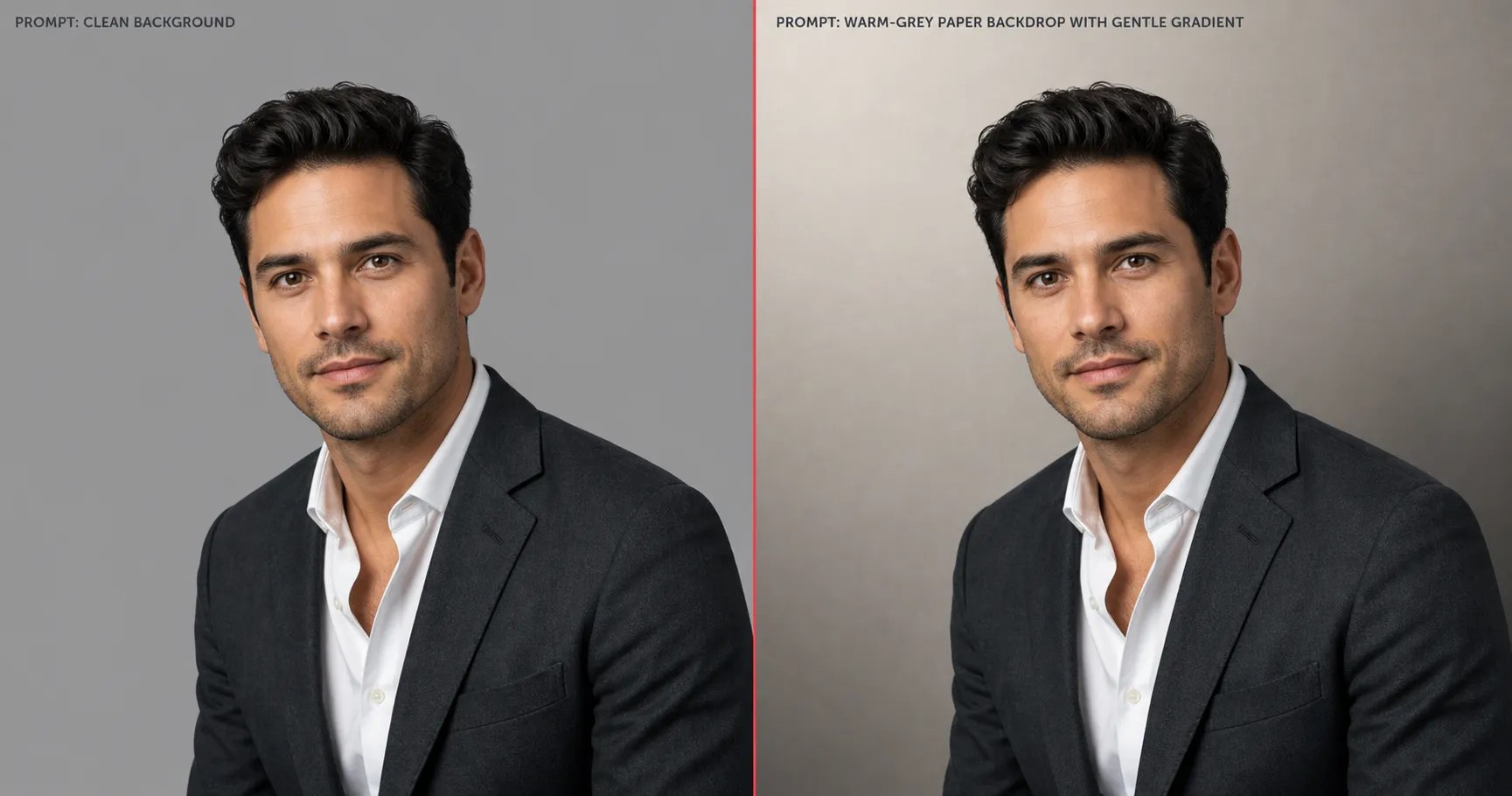
“Clean background” and “professional background” both produce the same generic grey infinity-cove studio that has been the AI-default backdrop since the first widely available image model. The phrase “clean” does not specify a surface; the model fills the absence with its most-averaged backdrop.
The counter-tactic is to name a photographic surface or a real room: warm-grey paper backdrop, or west-facing window with sheer curtain.
warm-grey paper backdrop
Or, for an environmental portrait:
west-facing window with sheer curtain, soft daylight wrap
Full pack-level prompt — Tactic 5, Background (swap the persona for your own subject):
Generate this image:

A 1200x630 16:9 cinematic environmental editorial portrait of a 60-year-old book author at home. The background is the focal demonstration: a west-facing window with a sheer linen curtain producing soft directional daylight wrap and a believable depth field, the subject placed roughly 18 inches inside the window frame so daylight wraps the left side of the face and falls off into gentle shadow on the right, a lived-in study visible in the soft-focused background — a half-empty bookshelf with worn book spines, a single brass desk lamp turned off, a wood-grain wall with one framed black-and-white photograph slightly out of focus, depth of field shallow enough that the subject stays sharp while the room reads as a real photographed environment rather than a staged backdrop. Subject seated, three-quarter angle, body angled camera-left, subject 50% of frame, head at 1/6 frame height. Identity locked: long rectangular face with high forehead, calm blue-grey eyes spaced wide behind clear-frame reading glasses pushed slightly down the nose, silver short-cropped hair receding at the temples, well-trimmed grey beard, fair Northern European complexion with weathered character lines. Skin baseline-real: visible pores, fine micro-texture, micro-asymmetry, no porcelain smoothing. Charcoal merino crewneck under a slate-grey wool cardigan with leather elbow patches. Output: single photoreal 1200x630 16:9 horizontal cinematic editorial environmental portrait, identity-locked, photographic output format.

Rules the AI must follow:
- Aspect ratio 16:9 horizontal cinematic editorial portrait
- Identity preservation is the highest-priority constraint
- Background must read as a named photographed environment per the window-and-room clauses, not as a generic clean studio
- One human figure
- No text, captions, watermarks, logos, or readable signage
- Single photoreal image output
- Output the image directly without explaining the prompt back
Both variants give the model a deliberately chosen surface to render (one studio, one environmental) instead of an absence to fill. The studio variant produces a paper roll with a soft vertical gradient and a hint of texture; the environmental variant produces motivated daylight wrap and a believable depth field. Pick the variant that matches the rest of the prompt’s mood: studio for editorial polish, window for lifestyle warmth.
The bigger pattern: concrete beats adjective, at the right token positions
Five tactics, one underlying move: every counter-tactic replaces a vague adjective with a concrete technical parameter. “Good skin” becomes a four-element micro-texture spec. “Good lighting” becomes a 45° angle plus a fill character. “Flattering composition” becomes a fraction. “Professional attire” becomes a material-color-garment triple. “Clean background” becomes a named photographic surface. The rule generalizes cleanly into a one-sentence rewrite move our 125 prompts apply universally, articulated in the methodology source we maintain across the corpus: concrete technical parameters defeat vague adjectives wherever the prompt body would otherwise leave the model to average toward a default.
Knowing what to write is half. Knowing where to put it is the other half. Documented LLM attention behavior, from the original Transformer paper (Vaswani et al., 2017) onward through the position-bias literature (Liu et al., 2023, “Lost in the Middle”), describes non-uniform attention favoring sequence endpoints: the opening and closing tokens carry disproportionate weight, and the middle is discounted. The practical consequence for image prompts is the first-and-last-token rule: aspect ratio, identity, and output format type must appear at both the start AND the end of the prose body, not only once in the middle. A prompt that names “16:9 horizontal cinematic editorial portrait” up front and again at the close ships with both anchors weighted; a prompt that names them once in the middle gets washed out by whatever transformation language follows.
Identity sits one rung above all five tactics. Our methodology treats identity-lock as the highest-priority constraint whenever a real face is involved: front-loaded, repeated at close, and reinforced by material-specific wardrobe (Tactic 4) and explicit composition fractions (Tactic 3). For the four-line prompt structure that operationalizes this, see the deep dive on the Identity-Lock technique. For the attention mechanism itself, see the first-and-last-token rule for image prompts.
| Adjective you typed | Concrete substitute you should have typed |
|---|---|
| good skin / smooth skin / beautiful face | visible pores, fine micro-texture, micro-asymmetry, no porcelain smoothing |
| good lighting / soft lighting / professional lighting | directional cinematic key light from upper-left at 45°, cool fill on shadow side |
| flattering composition / well-framed | three-quarter angle, body angled to camera, subject 50-70% of frame, head 1/7 of frame height |
| professional attire / business clothes | charcoal suit jacket over crisp white open-collar shirt (or any specific material + garment + color triple) |
| clean background / professional background | warm-grey paper backdrop, or west-facing window with sheer curtain |
How models compare
The five tactics work model-agnostically. The same rewrite move shifts output on GPT-Image-2, Nano Banana Pro (Gemini 3 Pro Image), Midjourney v8.1, and Flux 2 Pro alike. All four were released or majorly upgraded inside the past twelve months: Google DeepMind launched Nano Banana Pro / Gemini 3 Pro Image in November 2025 with native 2K and 4K output and up to eight reference images per prompt; OpenAI shipped GPT-Image-2 on April 21, 2026 with reasoning-first generation and ~99% text rendering; Midjourney shipped V8.1 on April 30, 2026 with native 2K HD rendering as the new default; and Black Forest Labs’ Flux 2 Pro holds the top tier on photorealism on the LMArena image leaderboard. The release timeline matters because the five-symptom default surfaces on all four despite that twelve-month sprint of upgrades; the porcelain-default mean is a training-distribution problem, not a model-generation problem.
What differs across models is the failure rate at the margins. Midjourney still drifts identity faster on long prompts than GPT-Image-2; Nano Banana Pro renders cinematic lighting more faithfully than GPT-Image-2 in some scenes (its multi-reference blending up to eight images per Google DeepMind’s release blog gives it more identity context to anchor against); Flux 2 Pro is the strongest on photorealism but loses ground on prompt adherence at extreme transformations. For a per-model failure-rate matrix across all five tactics, see the 2026 benchmark of GPT-Image-2 vs Nano Banana vs Midjourney vs Flux. The tactics are the constant; model choice changes the failure rate, not the fix.
The full failure taxonomy
The five failure modes addressed in this article (porcelain skin, flat light, stock composition, generic attire, empty background) are the most visible across portrait work, but they are five entries in a twelve-mode taxonomy our build process uncovered. The remaining seven include hallucinated hands, garbled text, gravity violation, aspect-bleed, prompt-leakage, watermark contamination, and AI-default symmetry. Each has its own rewrite move; the same concrete-beats-adjective rule applies. The full encyclopedia of all twelve, with a paired before-after frame for each, lives in the 12 failure modes of AI image generation.
FAQ
Q: Why do AI portraits always look fake or plastic?
A: The five-symptom AI default (porcelain skin, symmetric composition, flat front-light, generic attire, clean background) is the statistical mean of the training distribution every leading image model was trained on. Stock-photo libraries and agency headshot reels in which airbrushed-skin retouching had already won the editorial battle dominated that distribution, so the model’s default output converges on the smoothest, most-averaged version of every variable. The “fake” tell is structural, not a one-model bug.
Q: How do I make AI images look more realistic?
A: Replace every vague adjective in the prompt body with a concrete technical parameter. “Good skin” becomes “visible pores, fine micro-texture, micro-asymmetry, no porcelain smoothing.” “Good lighting” becomes “directional cinematic key light from upper-left at 45°, cool fill on shadow side.” “Flattering composition” becomes explicit fractions (three-quarter angle, 50-70% frame occupancy, head 1/7 of frame height). The five tactics in this article cover skin, light, composition, attire, and background; the same rewrite move applies to each.
Q: Why does AI skin look so smooth?
A: Because the training distribution it was averaged across was dominated by retouched stock-portrait data where airbrushing had already happened upstream. The model’s default is “no pores” because most of its examples had no visible pores. Writing the micro-imperfection trio (visible pores, micro-asymmetry, fine micro-texture, no porcelain smoothing) into the prompt body overrides the default by giving the model specific texture targets instead of one averaging adjective.
Q: Does prompt length matter for AI images?
A: Less than position does. LLM-based image models attend most heavily to the opening and closing tokens of the prose body and discount the middle (the first-and-last-token rule). Aspect ratio, identity, and output format type belong at both the start and the end of the prompt body. A long prompt that buries those anchors in the middle drifts more than a short prompt that bookends them.
Q: What is the best prompt structure for realistic AI portraits?
A: Identity first, transformations second, anchors at both ends. Open with identity-lock (face shape, hairline, eye spacing, recognition points), then layer the five anti-plastic tactics in the prose body (skin, light, composition, attire, background), then close by restating aspect ratio + identity + format type. The four-line prompt structure that operationalizes this is the Identity-Lock technique.
Key Takeaways
- The “AI plastic” look is structural, not random: it’s the statistical mean of the training distribution surfacing as the default output. Five named symptoms (porcelain skin, flat light, stock composition, generic attire, empty background) appear together across every leading model in 2026.
- Five language tactics rewrite the prompt away from that mean: micro-imperfection skin spec, directional 45° light spec, compositional fractions, material-specific attire, and a named-scene background. All five are concrete technical parameters replacing vague adjectives.
- Identity is the highest-priority anchor whenever a real face is involved. Front-load it, repeat it at close, and reinforce it with the material-specific wardrobe and fraction-based composition tactics.
- The first-and-last-token rule says aspect ratio, identity, and format type must appear at both the start AND the end of the prose body. A buried-in-the-middle anchor gets discounted.
- The tactics are model-agnostic. Failure rates differ across GPT-Image-2, Nano Banana Pro, Midjourney v8.1, and Flux 2 Pro at the margins, but the rewrite move is the same on each.
What this doesn’t fix
Anti-plastic prompting does not make every image realistic in every scene. Identity-lock has hard limits at extreme transformations (period-piece eras, stylized animation transfers, age progressions of 30+ years). Some models are structurally worse for portraits, and no amount of language fully fixes them; the rewrite shifts the failure rate, not the underlying model capability. And realism is not the only goal: there are stylization tasks where porcelain skin and flat light are exactly the right choices. The five tactics are the move when you do not want the AI-default tell; the choice to want it or not still belongs to you. For the 普通人 deep dive on the broader symptom space, see why AI images look fake.
The five tactics in this article are the surface methodology. The full corpus of 125 production prompts, every one of which embeds these tactics inside an identity-locked single-paragraph prose body, lives in the image prompts pack, the production library that embodies the rewrite move at every entry.