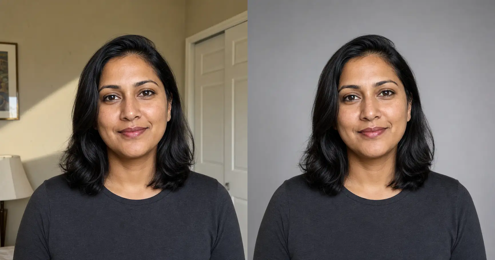
Your professional headshot background is doing more work than your face is. When a headshot reads as a phone snap instead of a real photo, the face is almost never the reason. It is the beige bedroom wall behind your head, the hard shadow cutting across it, or a color that swallows your shirt. Pick the right background color, then either shoot it clean or swap the bad one you already have, no reshoot and no studio fee.
The background is doing the job you think your face is doing
A hiring manager scanning a directory of headshots is not studying your face. She is pattern-matching for the one that looks professional and skipping the rest in about a second each. The background is the largest block of color in that thumbnail after your face, and it decides, before she reads anything, whether your photo belongs in the professional pile or the snapshot pile.
This is why the background is a signal, not decoration. A good background disappears and lets the face carry the read. A bad background competes with the face and wins, which is the last thing you want it to win.
LinkedIn’s own published profile-photo guidance makes the same point in plainer terms: it recommends a plain, uncluttered background with your face occupying around 60% of the frame. The instruction is not “make it pretty.” It is “make it quiet.” Professional headshot photographers, the ones who rank for these searches like City Headshots, converge on the identical rule from the other direction: the background’s only job is to not have a job.
Which is why the first decision is not “where do I stand.” It is “what color goes behind me.”
Best background colors for a headshot
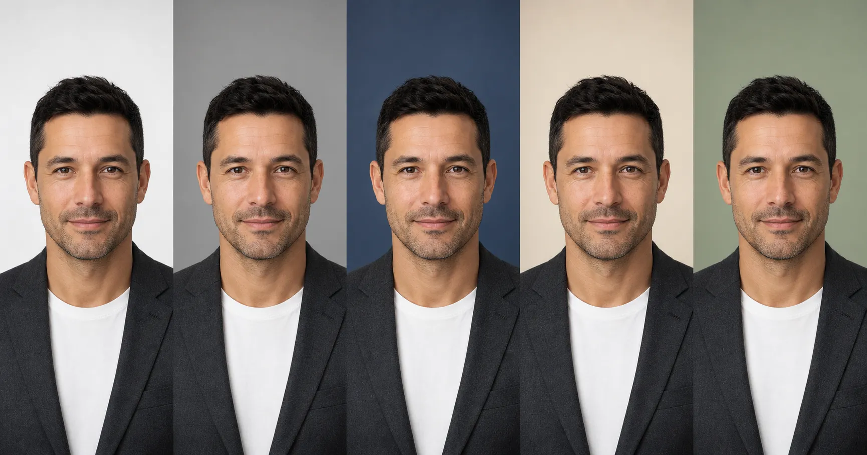
There is no single best background color, because the color is chosen by what it has to do for your face, not by your taste. Here is the same person rendered against five common backdrop colors, with nothing else changed, so you can see the read shift while the person stays identical.
The safe default: neutral mid-gray
Mid-gray is the answer to the “most professional background color” question more often than any other, and for one reason: it is the most neutral. It adds no color cast, no mood, no opinion. It steps back and lets your face and your clothing do the talking. Adobe’s published headshot guidance and working headshot photographers both land here as the all-purpose choice. The only way to get it wrong is to push it too dark, where a true mid-gray turns into a muddy charcoal.
The clean options: soft white and deep slate-blue
Soft white is the passport-and-directory look: open, modern, spec-compliant. It is the right call when the photo has to read as plain and official. Its one trap is that a light shirt melts into it, so white wants darker clothing in front of it. Deep slate-blue is the quiet upgrade for executives, consultants, and speakers who want a little more presence than flat gray gives. It adds depth without adding color noise, as long as you keep the saturation restrained.
The warm and considered options: cream and muted color
Warm cream reads approachable and editorial, which suits creatives, coaches, and client-facing roles. A single muted color, a desaturated sage or a soft terracotta, signals one intentional choice rather than noise. The line you do not cross is saturation: any bright version of these pulls attention straight off your face. Pure black is the one to be careful with for most people, because dark hair and dark clothing vanish into it and you lose the edge that separates you from the backdrop.
The whole reference, compressed into one table you can screenshot:
| Backdrop color | What it signals | Who it suits | Watch out for |
|---|---|---|---|
| Neutral mid-gray | Calm, neutral, lets the face and wardrobe carry the read | Almost everyone; the safe default for finance, corporate, and general professional use | Going too dark turns it muddy; keep it a true mid-gray, not charcoal |
| Soft white | Clean, open, modern; the “passport / directory” look | Tech, healthcare, anyone needing a plain spec-compliant background | A light shirt melts into it; harsh white also blows out and flattens the face |
| Deep slate-blue | Quiet authority, a touch of depth without color noise | Executives, consultants, speakers wanting more presence than flat gray | Push the saturation too far and it competes with the face |
| Warm soft-cream | Approachable, editorial, warm without being loud | Creatives, coaches, client-facing roles, warmer skin tones | Can read yellow if the white balance is off |
| Muted sage / desaturated color | Considered, on-brand, a single intentional color choice | Creatives and personal brands that want one color cue | Any high-saturation version pulls attention off the face |
| Pure black | Dramatic, editorial | Rare; actor or artist portraits | Dark hair and dark clothing disappear into it; loses edge separation |
| Busy / real-room background | Nothing professional; reads as a phone snap | No one, for a professional headshot | Clutter, intruding objects, and harsh wall shadows are the top tell |
Pick the color by the job your face has to do. Then the only question left is how to actually get that background behind you.
How to change your headshot background
You do not have to stand in front of a camera again. The “how to change headshot background” question has a mainstream answer and a better answer. Here is the path that produces a headshot, not just a cutout.
Step 1: Start from the photo you already have
You need one clear, front-facing photo where your face is well lit. The background can be anything, a messy room, a harsh wall, a window behind you, because you are about to replace it. What you will see when you have the right starting photo is a face that reads clearly; if the face itself is dark or blurry, fix that first, because no background swap rescues a bad exposure on the subject.
Step 2: Swap the background, keep yourself
The mainstream tools do the literal cutout. Adobe and Canva both ship one-click background removers, and the iPhone Photos app can lift the subject off its background by touch, per Apple’s own support guidance. Those get you a transparent cutout. The better route, the one that produces a believable headshot rather than a floating cutout, is to ask an AI image tool to keep your face, hair, skin tone, expression, and clothing exactly as they are and replace only the backdrop, relit to match the light already on your face.
Upload the headshot you already have, paste the block below, and swap the one placeholder for the backdrop color your job needs.
Show the full promptTap to expand
Paste this into your AI (ChatGPT, Claude, Gemini, or any image tool).
REQUIRED upload before pasting: the headshot you already have. This is the face and outfit the AI keeps; only the background changes.
Then swap the single placeholder {BACKDROP} for the backdrop color your job needs.
Generate this image:
Take the person in the uploaded reference photo and place them against a new professional studio background, keeping the person exactly as they are. Match their face, bone structure, eyes, nose, lips, hair, skin tone, expression, and clothing exactly as in the uploaded photo so they are unmistakably the same person, only the background changes. Replace the original background with a {BACKDROP} that is smooth, even, low in saturation, and completely uncluttered, with a gentle soft falloff from center to edges. Relight the new background so its light direction and warmth match the existing light on the person’s face, with no shadow falling in a direction that disagrees with the face light. Keep a clean, natural edge around the hair and shoulders, preserving individual hair strands softly against the backdrop, with no bright halo fringe and no chopped-off strands. The subject occupies about 60 to 65 percent of the vertical frame, head-and-shoulders crop. Keep visible pores, fine skin micro-texture, and natural micro-asymmetry on the face, with no porcelain smoothing. Output a single head-and-shoulders professional headshot of the same person against the new {BACKDROP}, identity-locked to the uploaded photo.
Rules the AI must follow:
- Identity preservation is the highest-priority constraint: the face, hair, skin tone, expression, and clothing must match the uploaded photo exactly; the subject must be unmistakably the same person
- Change ONLY the background; do not restyle the face, do not change the clothing, do not slim or age or beautify the subject
- The new background light direction and temperature MUST match the existing light on the face; no fighting shadow, no second light source that disagrees with the face
- Clean natural hair edge: preserve individual strands softly, no halo fringe, no hard cutout outline, no chopped strands
- Keep visible pores and natural skin texture; no porcelain smoothing, no waxy AI-plastic surface
- One human figure only; no extra people, no props, no objects in the new background
- No text, captions, watermarks, logos, or readable signage anywhere in the frame
- Single image output: one head-and-shoulders headshot, no grid, no before/after split, no multiple angles
- Output the image directly without explaining the prompt back
Replace these placeholders with your details:
{BACKDROP}= the backdrop color your job needs. Default: a neutral mid-gray seamless studio backdrop. Other options: a soft white seamless backdrop, a deep slate-blue backdrop, a warm soft-cream backdrop, or a muted sage-green backdrop.
Bonus tips.
- If the new edge still halos, re-run and add “feather the hair edge naturally into the backdrop” to the rules.
- Match the backdrop to the value of your top: if you are wearing a light shirt, a mid-gray or slate-blue backdrop keeps you from melting into a white wall; if you are wearing dark clothing, soft white or warm cream keeps you from disappearing into a dark backdrop.
- Need the same headshot for a passport or a square LinkedIn crop? Re-run with the aspect line swapped at the start and the end, leave everything else identical.
Step 3: Check the one thing that gives a swap away
When the new image comes back, look at exactly two places before you use it: the edge around your hair, and the direction of the shadow behind you. A clean swap has soft, natural hair strands against the backdrop and a background lit from the same side as your face. A bad swap has a pale halo fringe around your head or a shadow falling the wrong way. If you see either, re-run. That check is the difference between a headshot and an obvious paste job.
The swap only reads real if the new background’s light matches the face, which is the same realism rule that separates a studio shot from an AI default.
The tell that gives away a bad background swap
A swapped background fails for one reason, and it is not the color. It is the light. When the backdrop behind you is lit from a different direction than your face, your eye catches the disagreement instantly, even if you cannot name it. Add a pale halo where a rough cutout met the new background, and the photo announces that it was edited.
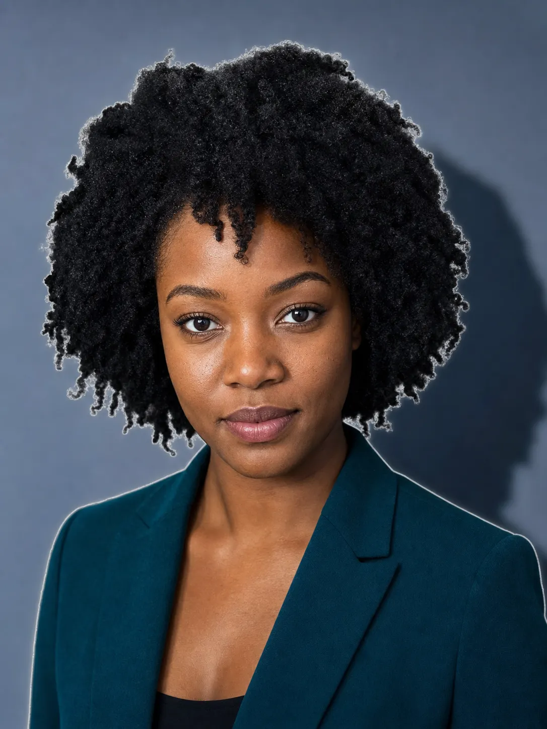
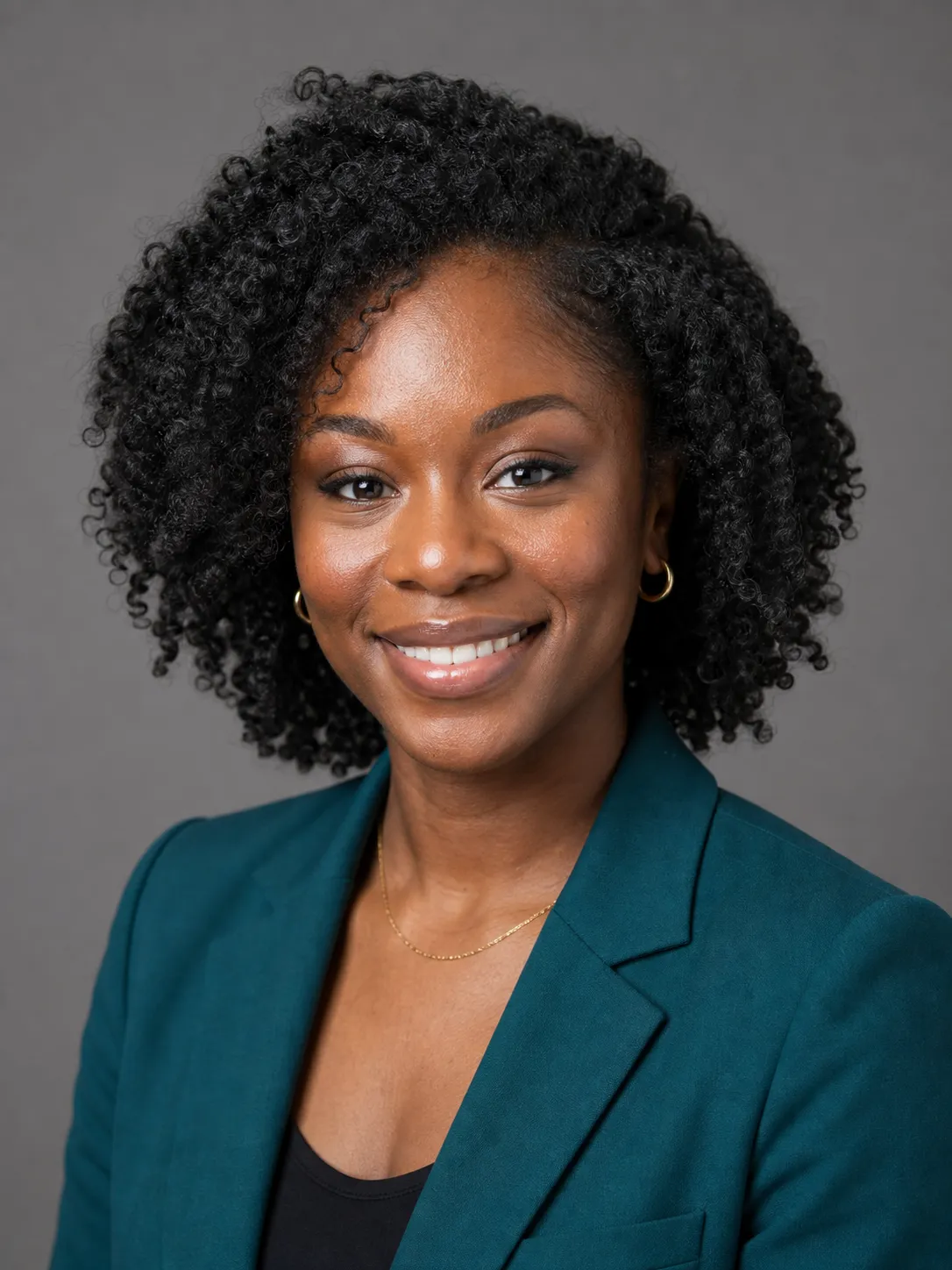
This is the same mechanism that makes AI portraits read as fake in general, and it is worth understanding once rather than guessing at every render. The wax-figure tell, the edge artifacts, the lighting that does not sit together, all of it is broken down in our method piece on the anti-plastic AI image method and the companion on why AI images look fake. The short version for backgrounds: a composite is believable only when the subject and the backdrop share one light direction and one color temperature. Get the light and the edge right, and the swapped background is indistinguishable from a backdrop you paid a studio for.
Backdrop color versus the color you wear
There are two color decisions in a headshot, and people collapse them into one. The backdrop color is one. The color you wear is the other. They are not the same decision, and the entire point is that they have to disagree.
If your shirt and your background land on the same value, light shirt against a white wall, dark jacket against a black backdrop, you melt into the background and lose the edge that makes you a person standing in front of something. A light top wants a mid-gray or slate-blue behind it. A dark top wants soft white or warm cream. The contrast is what gives you shape.
So this article owns the backdrop color, and its sibling owns the clothing color. If you are deciding what to wear, that is a separate piece on what color to wear for a headshot, broken down by skin tone and role. And if you would rather shoot the whole thing clean from the start instead of swapping afterward, the how to take a professional headshot at home guide covers the setup. The live companion piece on LinkedIn headshot examples by job shows how the right backdrop pairs with the right wardrobe for seven specific jobs.
The reason this is worth doing yourself is the arithmetic. A professional headshot session in the US runs roughly $300 to $1,200 for a single one-hour sitting, per published rates at studios like Capturely and the editorial-tier pricing at boutique studios like The Light Committee. A large share of that fee is the studio, the lighting, and the backdrop, the exact part a clean background swap reproduces for free.
Backdrop color sets the stage. Wardrobe color is what stands on it. Get both right, and the headshot stops looking accidental.
FAQ
Q: What is the best background color for a professional headshot?
A: For most people the safest professional background is a neutral mid-gray, because it stays quiet and lets your face and clothing carry the read. Soft white is the next default and the right call for a passport-style or directory photo, though a light shirt can melt into it. Deep slate-blue adds quiet authority for executives and speakers. Warm cream reads approachable for creatives and client-facing roles. The rule that holds across all of them, echoed in Adobe’s published headshot guidance and by professional headshot photographers, is the same: keep the background low in saturation and uncluttered, so it never competes with the face.
Q: What background colors should I avoid for a headshot?
A: Avoid anything high in saturation, anything busy, and pure black for most people. A bright or patterned background pulls the eye off your face, which is the one thing the photo exists to show. Pure black makes dark hair and dark clothing disappear into it and you lose the edge that separates you from the backdrop. The single worst background is a real room: a cluttered wall, an intruding lamp or door, a hard diagonal shadow. That clutter is the top reason a headshot reads as a phone snap rather than a professional photo.
Q: How can I change the background of an existing photo?
A: You do not need to reshoot. Background replacement is a standard consumer feature now: Adobe and Canva both ship one-click background removers, and the iPhone Photos app can lift the subject off its background by touch. For a clean headshot result, the better route is to ask an AI image tool to keep your face, hair, skin tone, expression, and clothing exactly as they are and replace only the background with a smooth studio backdrop, relit to match the light already on your face. The paste-ready prompt in this article does exactly that.
Q: Should a professional headshot have a background, or should it be plain white?
A: It should have a background, just a quiet one. Plain white is one valid choice and the standard for passport and directory photos, but it is not the only professional option, and a light shirt can vanish into it. A neutral mid-gray or a deep slate-blue often reads as more considered because it gives the face a little separation without adding noise. The goal is not “white” specifically; it is a background calm enough that the face is the only thing the viewer reads.
Key Takeaways
- The background is a signal, not decoration. A good one disappears and lets the face carry the read; a bad one competes and wins. LinkedIn’s own profile-photo guidance says the same thing: plain and uncluttered, face at around 60% of the frame.
- There is no single best background color. Neutral mid-gray is the safe default, soft white is the passport look, deep slate-blue adds quiet authority, and warm cream reads approachable. Avoid high saturation, busy rooms, and pure black.
- You can fix a bad background without reshooting. Adobe and Canva ship one-click removers and the iPhone can lift the subject, but an AI swap that keeps your face and matches the light produces a headshot, not a floating cutout.
- A swap gives itself away through the light and the edge, not the color. Check the hair edge for a halo and the shadow for the wrong direction before you use it.
- Backdrop color and wardrobe color are two decisions that have to contrast. Light shirt wants a darker backdrop; dark top wants a lighter one.
The same photo, re-run
Go back to the headshot you were unhappy with. The face was probably fine the whole time. It was the wall behind it, the shadow, the color that ate your shirt. That is the part you can fix without standing in front of a camera again: pick the color the photo needs, swap the background, match the light, check the edge.
So which background is yours, the one that disappears, or the one that has been quietly skipping you? You can swap the full set of career-photo prompts, including the background-replace prompt, in the Image Prompt Pack for $19, or just paste the one above and see your headshot stop looking accidental.