
You want that warm, optimistic 1960s look on the wall: mustard and teal shapes, an atomic starburst, the kind of print that makes a room feel like a tasteful mid-century living room. So you priced it out. A custom abstract print from a designer runs real money and takes days, and the design software wants hours you do not have. Here is the third door: one AI prompt turns a few shapes into a gallery-grade mid-century modern poster in about two minutes, with no design software and no designer.
Why the two normal routes both make you pay first
There are two normal ways to get a mid-century modern poster, and both ask you to pay before you ever see it.
The first is to hire someone. A custom abstract print from a freelance designer on a marketplace like Fiverr commonly runs from about $50 to $200, and the good ones quote in days, not hours. You describe what you want, you wait, and the first time you see the actual poster is when it lands in your inbox. If it is wrong, you are into another revision round.
The second is to make it yourself in design software. Illustrator, Photoshop, and Canva can all do it. None of them will teach you what makes the style work, and mid-century shape composition is its own craft. You can spend an evening learning the pen tool and still produce something that looks almost right and reads as off.
There is a real difference hiding in those two routes. One asks you to pay in money. The other asks you to pay in hours. The AI way asks for neither up front: you see the poster first, then decide if it earned a frame.
Here is the same choice laid out flat.
| Hire a designer | Learn the design software | The AI prompt way | |
|---|---|---|---|
| What it costs | About $50 to $200 for a custom print on freelance marketplaces like Fiverr | $0 in cash, but the software subscription plus hours of your time | The price of a print. The prompt is free to run |
| How long until you see it | Days of back-and-forth; no preview before delivery | Hours to learn mid-century shape composition well enough to not look off | About two minutes per render |
| Skill required | None, you outsource it | Real design skill in Illustrator, Photoshop, or Canva | None, you paste one prompt |
| Redo if it’s wrong | Costs another revision round, if the designer allows it | Start the file over | Regenerate free, as many times as you want |
| Looks authentically mid-century | Depends entirely on the designer you drew | Only if you already know the five marks | Built in: the prompt locks all five marks |
Neither old route is a scam. They just both bill you before the reveal.
The 5 marks of mid-century modern design
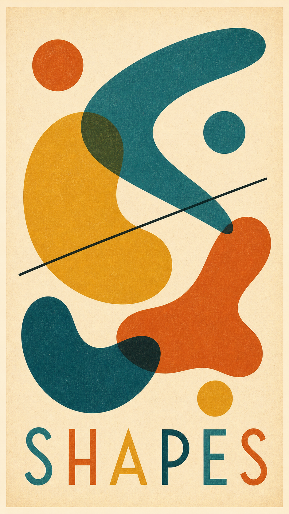
Before the prompt, the taste. A mid-century modern poster is not a vague mood you sprinkle on some shapes. It is a specific look that designers used from the 1940s through the 1960s, and once you can name its parts, you can tell the AI to hit every one.
The look comes from the post-war design boom, roughly the 1940s through the 1960s, the era of Eames chairs, atomic-age optimism, and warm modern interiors. Wikipedia’s overview of mid-century modern dates the movement to the mid-20th century, spanning 1940s, 1950s, and 1960s design. The phrase itself was popularized by Cara Greenberg in her 1984 book Mid-Century Modern: Furniture of the 1950s, decades after the chairs were built. Strip the famous prints down and the same five things show up every time. Call them the 5 marks of mid-century modern design.
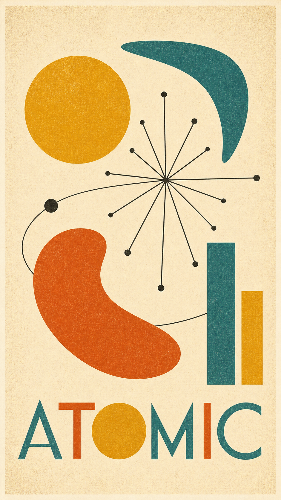
- Organic and geometric shapes together. The signature vocabulary: boomerangs, atomic starbursts, kidney curves, amoeba blobs, clean circles, and thin connecting lines. Hard geometry and soft organic curves in the same frame. This is the look Wikipedia’s entry on Atomic Age design places at roughly 1945 to 1967, built on the starburst motif and the boomerang. This shape set is what makes the style read instantly.
- A warm muted palette. Mustard yellow, teal, burnt orange, olive green, and a few deep accents on a cream or warm-tan ground. Every color looks like it has a little grey or brown in it, the way a 1960s print aged. Not bright primaries, which read modern.
- Flat layered shapes, no shading. Each shape is a single flat color with crisp edges, layered so overlaps make simple secondary tones. No gradients, no 3D, no realistic lighting. The flatness is the whole point.
- Playful asymmetric balance. Nothing dead-centered. Shapes sit off to one side and the composition balances by feel, with generous negative space holding it together. This is what keeps it from looking like a logo.
- A subtle grain or texture fill. A faint paper grain or screen-print texture across the flat color, so it reads as a handmade 1960s print pulled by hand, not a clean digital file.
Get these five right and the poster reads as a 1960s original. Miss them and you get a cold flat graphic with a word on it, which is exactly what the prompt below is built to prevent.
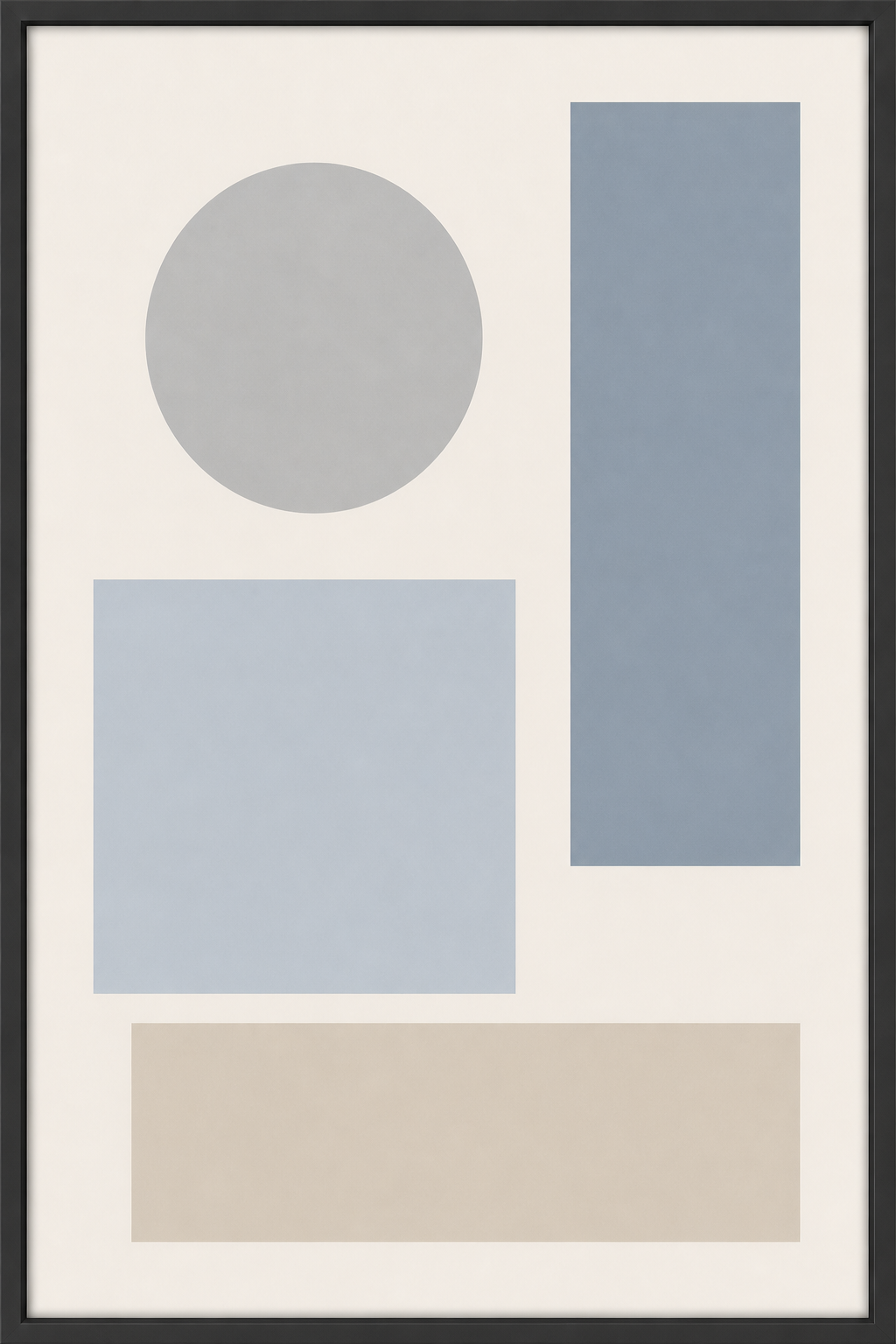
Here is the difference the five marks make. The generic abstract graphic most people start from first, then the same simple shapes rebuilt to obey all five.
The prompt: paste it, swap three lines
Paste the block below into ChatGPT, Gemini, or any AI image tool, and swap three lines for the shapes, palette, and title you want on your wall.
Show the full promptTap to expand
Paste this into your AI (ChatGPT, Gemini, Claude, Midjourney).
No subject in mind? Leave the shapes line as written and you get the classic atomic-age starburst. The style works from the shape set and palette alone.
Generate this image:
A 9:16 vertical mid-century modern abstract art poster in the atomic-age style of 1950s and early 1960s American design, with the poster title {POSTER_TITLE_TEXT} rendered in clean geometric mid-century sans-serif display typography across the lower portion, spelled exactly as written and clearly legible. The composition is built from flat layered shapes on a warm cream ground: {SHAPES}. Palette: {PALETTE}. Every shape is a single flat color with crisp edges, layered so overlaps make simple secondary tones, with playful asymmetric balance and generous negative space. A subtle paper grain and faint screen-print texture across the flat color, so it reads as a handmade 1960s print, not a clean digital file. Decorative, optimistic, unmistakably mid-century.
Rules the AI must follow:
- Aspect ratio 9:16 vertical, stated at the start and again here at the end.
- Render the title
{POSTER_TITLE_TEXT}verbatim and spelled correctly in clean geometric mid-century type. No garbled letters, no character substitutions, all text in English Latin script. - Flat layered shapes only, with a subtle grain fill. No shading, no gradients, no 3D, no realistic lighting, no smooth digital vector look.
- Warm muted palette only. Every color reads aged and slightly greyed. No bright primaries, no neon.
- Playful asymmetric balance with generous negative space. Nothing dead-centered.
- Single image only. No moodboard, no contact sheet, no variant grid. Output the image directly.
Replace these placeholders with your details:
{SHAPES}= the shapes you want, e.g.an off-center atomic starburst of thin radiating lines, a cluster of boomerang and kidney curves, a few clean circles, and a thin connecting line{PALETTE}=warm mustard yellow, teal, burnt orange, and cream{POSTER_TITLE_TEXT}=ATOMIC(your short title, in capitals)
Bonus tips. Swap all three lines at once for a coordinated new poster. Folk: stylized suns, birds, hearts, and little geometric flowers in burnt orange, mustard, and teal, title FOLK. Bloom: abstract boomerang leaves and geometric flowers in olive green, teal, and orange, title BLOOM. Orbit: a boomerang-finned rocket, orbit rings, and atomic starbursts in teal and burnt orange, title ORBIT. For a warmer or cooler room, push the palette line: “mustard and avocado green,” “teal and salmon pink,” or “sun-faded as if it hung in a window for 30 years.” If the title comes out garbled, paste the title rule once more at the very end.
The prompt is doing four jobs you would otherwise hire out.
- It names all five marks as hard rules, so the model builds the style instead of guessing at “mid-century.”
- It states the title rule and the 9:16 aspect twice, once at the top and once at the close, because a constraint repeated at the end of a prompt holds better than one stated only once.
- It leaves three lines open, the shapes, the palette, and the title, and locks everything else. Those three lines are where your taste enters the poster.
- It bans the two failure modes by name, shading and gradients, so the shapes come out flat. If the result still drifts toward the generic plastic look that gives AI images away, the flat-shapes rule is your fix.
Five mid-century looks, one prompt
The prompt above is a chassis. The three placeholder lines put your shapes in it; the style phrase decides the sub-genre. Keep everything else and swap that one phrase, “in the atomic-age style of 1950s and early 1960s American design,” for another, and the same flat-shape language re-skins into a completely different mid-century look. Here are five, starting with the atomic-age starburst the main prompt builds by default.
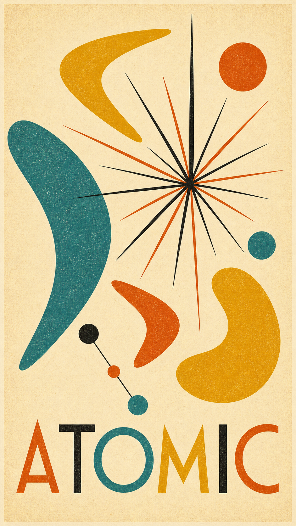
Atomic-age starburst (the default). The style phrase is the one already in the prompt: “in the atomic-age style of 1950s and early 1960s American design.” Radiating starburst lines, boomerang and kidney curves, warm mustard and teal.
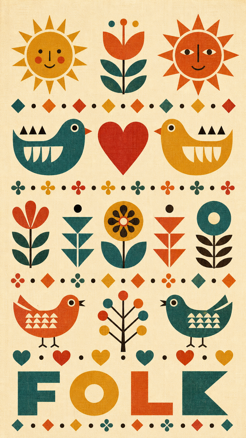
Girard folk-geometric. Alexander Girard ran the Herman Miller textile division from 1952 and built a folk-art vocabulary of suns, birds, and hearts, per Herman Miller’s own designer page. Swap the style phrase for: “in the folk-geometric style of Alexander Girard, a playful symmetrical arrangement of small flat folk-art motifs, stylized suns, birds, hearts, dots, and little geometric flowers, like a vintage textile.”
Eames-era abstract shapes. Charles and Ray Eames, the husband-and-wife design partnership documented at the official Eames Office, gave the era its calm, flat-shape geometry. Swap the style phrase for: “in the Eames-era abstract-shapes style of 1950s graphic design, a calm arrangement of large flat overlapping boomerang, kidney, and circle forms with a thin crossing line and deliberate asymmetry.”
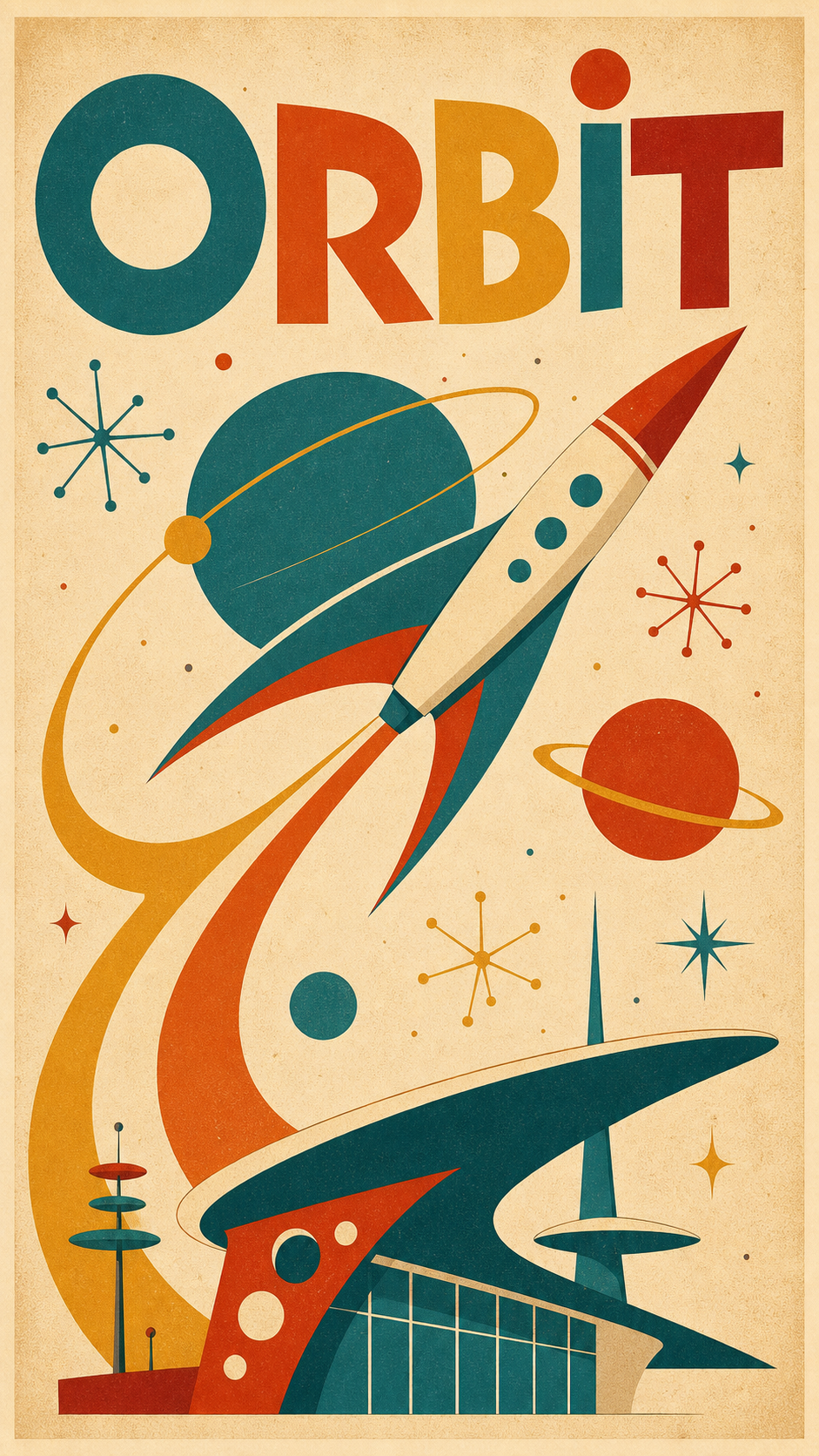
Googie space-age. Googie, the futuristic style Wikipedia ties to car culture, jets, the Atomic Age, and the Space Age, leans on boomerangs and upward motion. The launch of Sputnik in October 1957 poured rockets and orbit rings into the look. Swap the style phrase for: “in the googie space-age style of the late 1950s Space Race, a stylized boomerang-finned rocket, orbit rings, planets, and atomic starbursts with angled cantilevered shapes and upward motion.”
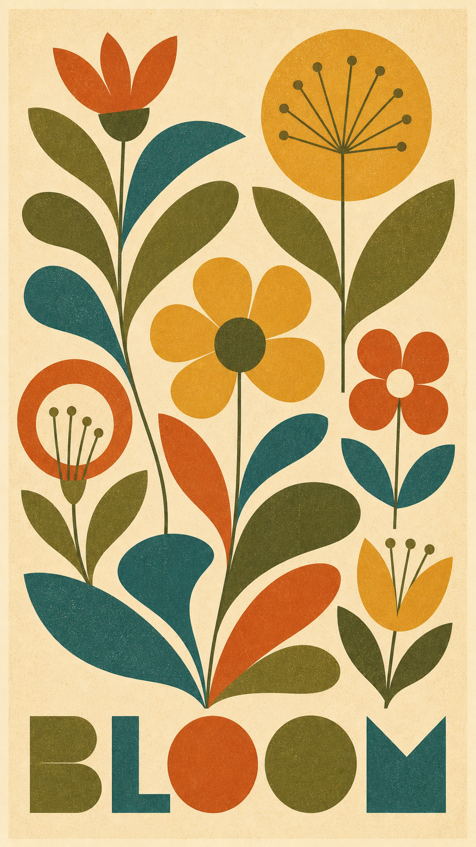
Stylized nature. Swap the style phrase for: “in the stylized-nature style of 1960s decorative design, tall stems with abstract boomerang and teardrop leaves, geometric flowers reduced to circles and petals, and a simple sun, all flattened into clean layered shapes.”
That is the whole trick: one chassis, five looks. Pick the shapes, pick the look, and regenerate until it sings.
One paste-ready AI art move a week, the kind you can use on a Tuesday or a Sunday. Subscribe to the newsletter.
Paste, render, refine, print
Once the prompt is in, the rest is mechanical.
- Paste the prompt and swap the three lines. Set the shapes, the warm muted palette, and the title text.
- Render it. You will have a poster in about two minutes. This is the same step that doubles as a full AI photoshoot move from one image once you see how far one prompt carries.
- Refine the two things that usually drift. If the title text comes out garbled, paste “render the poster title verbatim and spelled correctly in clean geometric mid-century type” again. If the shapes come out shaded or 3D, paste “flat layered shapes only, no shading, no gradient, no realistic lighting, subtle paper grain.”
- Regenerate until all five marks land. This is the half the designer cannot give you. You are not paying $200 to wait days for a poster that is almost right. You regenerate free until it is right.
- Upscale and print. Ask the tool for the largest size it offers and save as PNG. Print at 300 dpi at a standard vertical poster size: 12 by 18, 18 by 24, or 24 by 36 inches. Frame it.
You can make this in the studio right now without leaving the page, then come back and print the one you keep.
Other poster styles you can make
The mid-century modern poster is one doorway. The same paste-render-print move re-skins into every other wall-art style, and each one has its own short list of marks the way this one has five.
- Vintage travel. A deep framed view, a local signature trio, and a visible screen-print texture in bold vibrant color. (Guide: how to make a vintage travel poster.)
- Botanical print. A single specimen, centered and symmetrical, in a muted herbarium palette with a Latin-name label. (Guide coming soon: how to make a botanical poster.)
- Art deco. Geometric symmetry, a gold-and-black palette with one jewel tone, and stepped chevron borders. (Guide coming soon: how to make an art deco poster.)
- Minimalist travel. Two or three flat colors, one iconic form, and a lot of negative space. (Guide coming soon: how to make a minimalist travel poster.)
Different style, same five minutes.
Key Takeaways
- A mid-century modern poster is a named style, not a vibe: the 5 marks of mid-century modern design are organic and geometric shapes together, a warm muted palette, flat layered shapes, playful asymmetric balance, and a subtle grain fill.
- The two old routes both bill you before the reveal: a freelance designer commonly charges $50 to $200 over days, and design software costs you hours of skill-building. The AI prompt shows you the poster first.
- The prompt locks all five marks and leaves three lines open. You swap the shapes, the palette, and the title, and regenerate free until it reads as a 1960s original.
- Print at 300 dpi at a standard poster size and frame it. The same paste-render-print move re-skins into vintage travel, botanical, art deco, and minimalist styles.
FAQ
Q: How do you make a mid-century modern poster?
A: Five things do almost all the work. Build the art from flat layered shapes, organic and geometric together: boomerangs, atomic starbursts, kidney curves, no shading. Use a warm muted palette of mustard, teal, burnt orange, and cream. Balance the shapes with playful asymmetry instead of centering everything. Add a subtle paper grain so it reads as a handmade 1960s print, not a clean digital file. Then set a short title in clean geometric mid-century type as part of the design. The prompt in this article locks all five for you.
Q: Can I make my own mid-century modern wall art with AI?
A: Yes, and you no longer need design software or a designer to do it. Paste the prompt above into any AI image tool, swap the shapes, palette, and title for what you want, and you get a print-ready mid-century modern poster in about two minutes. A custom abstract print from a freelance designer on a marketplace like Fiverr commonly runs from about $50 to $200 and takes days. The prompt costs you the price of a print, and you can regenerate it free until it looks right.
Q: What colors are mid-century modern?
A: The signature palette is warm and muted, not bright primaries. Mustard yellow, teal, burnt orange, olive green, and a few deep accents like brick red, all sitting on a cream or warm-tan ground. The trick is muted and warm: every color looks like it has a little grey or brown mixed in, the way a 1960s print would have aged. Bright saturated color reads modern, not mid-century.
Q: What is the difference between mid-century modern and retro abstract?
A: Mid-century modern is a specific design era, roughly the 1940s through the 1960s, with its own rules: flat layered shapes, a warm muted palette, and playful asymmetric balance. Retro abstract is the broader bucket of old-feeling abstract art it lives inside. Every mid-century modern poster is a retro abstract poster, but not every retro abstract poster follows the five mid-century marks. The prompt here builds the specific mid-century version on purpose.
What would you hang in the warm corner of the room?
Not the print you saw in a catalog. The shapes and the two colors that make you feel like you walked into a tasteful 1960s living room.
That is the one to put through the prompt first. You can have it framed and on the wall by the weekend, for the price of a print, and the whole job started with you swapping three lines. If you want a running set of these prompts in one place, they live in the image prompt shop.
So: what is the look?