
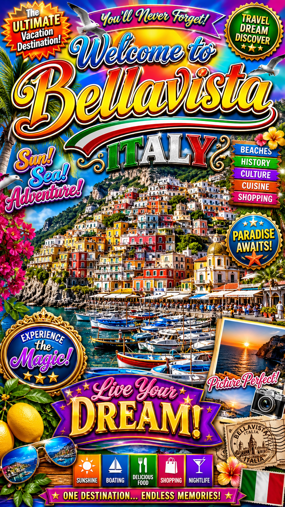
You found a place you keep meaning to get back to, and you want it on the wall as one of those calm, modern minimalist travel posters: a single mountain, two flat colors, a lot of quiet white space, the name in small letters at the bottom. So you priced it out. A custom poster from a designer runs real money and takes days, and the design software wants hours you do not have. There is a reddit thread for this exact search where someone is “struggling to find a good tutorial.” Here is the tutorial, and the third door it points at: one AI prompt turns any place into a clean minimalist travel poster in about two minutes, with no design software and no designer.
Why the two normal routes both make you pay first
There are two normal ways to get a minimalist travel poster, and both ask you to pay before you ever see it.
The first is to hire someone. A custom poster from a freelance designer on a marketplace like Fiverr commonly runs from about $50 to $200, and the good ones quote in days, not hours. You describe what you want, you wait, and the first time you see the actual poster is when it lands in your inbox. If it is wrong, you are into another revision round.
The second is to make it yourself in design software. Illustrator, Photoshop, and Canva can all do it. None of them will teach you what makes the style work, and minimalism is deceptively hard: it is easy to make something empty and easy to make something busy, and surprisingly difficult to land the calm middle. You can spend an evening learning the pen tool and still produce something that looks almost right and reads as off.
There is a real difference hiding in those two routes. One asks you to pay in money. The other asks you to pay in hours. The AI way asks for neither up front: you see the poster first, then decide if it earned a frame.
Here is the same choice laid out flat.
| Hire a designer | Learn the design software | The AI prompt way | |
|---|---|---|---|
| What it costs | About $50 to $200 for a custom poster on freelance marketplaces like Fiverr | $0 in cash, but the software subscription plus hours of your time | The price of a print. The prompt is free to run |
| How long until you see it | Days of back-and-forth; no preview before delivery | Hours to learn flat-vector minimalist illustration well enough to not look off | About two minutes per render |
| Skill required | None, you outsource it | Real design skill in Illustrator, Photoshop, or Canva | None, you paste one prompt |
| Redo if it’s wrong | Costs another revision round, if the designer allows it | Start the file over | Regenerate free, as many times as you want |
| Looks genuinely minimalist | Depends entirely on the designer you drew | Only if you already know the four rules | Built in: the prompt locks all four rules |
Neither old route is a scam. They just both bill you before the reveal.
The 4 rules of a minimalist travel poster
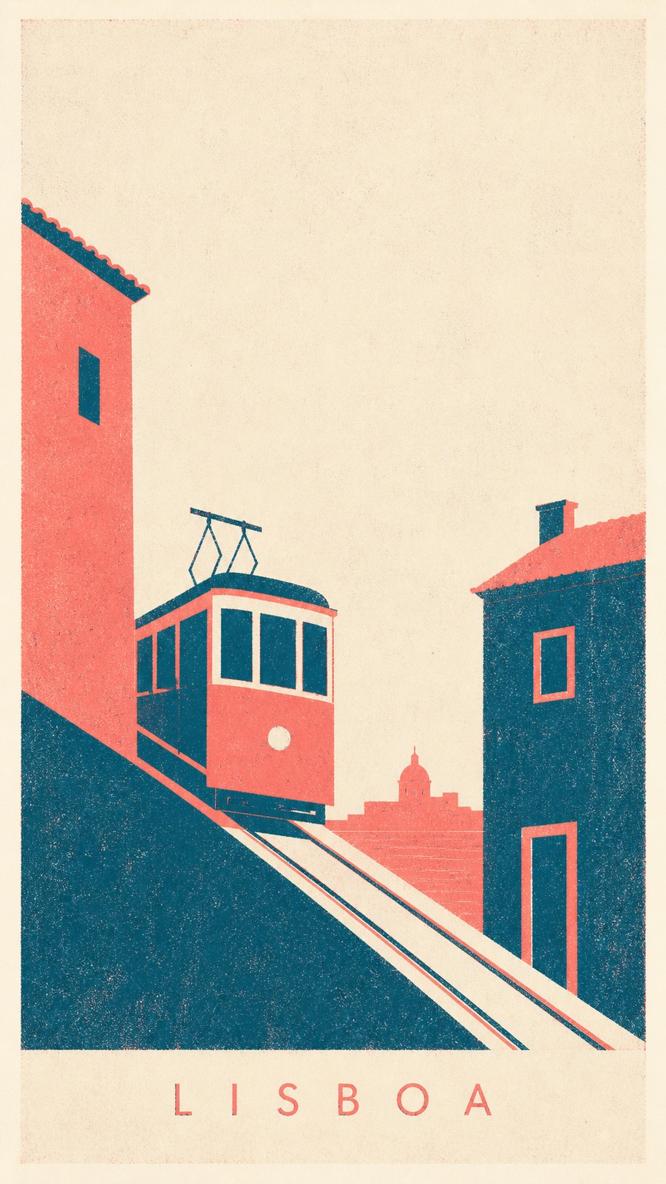
Before the prompt, the taste. A minimalist travel poster is not a photo with the color turned down. It is a specific discipline that modern poster designers use to make a place read in one glance, and once you can name its parts, you can tell the AI to hit every one. The look has a real lineage: the Bauhaus, the German design school, was known for what Britannica calls “a severe but elegant geometric style carried out with great economy of means,” and the postwar Swiss-led International Typographic Style pushed a neutral, objective look built on rational planning. That is the same instinct Tate names in minimalism proper: strip a thing down to simple geometric shapes until what you see is all there is.
The trap is thinking minimal means “less effort.” It means the opposite. Every element you keep has to earn its place, because there is nowhere to hide. Strip the good ones down and the same four things show up every time. Call them the 4 rules of a minimalist travel poster.
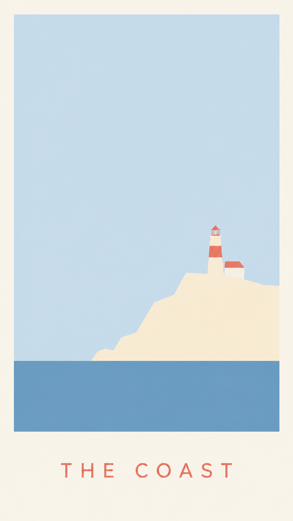
- Two or three flat colors, no gradients. A tight palette, flat fills, hard clean edges. No shading inside the shapes, no soft blends, no drop shadows. The restraint is the style. Add a fourth color and it starts to look like a brochure.
- One iconic form, reduced to flat geometry. A mountain, a wave, a sun, an arch, a single skyline silhouette, the one shape that says this place. You are not drawing the scene. You are reducing it to the single form a stranger would recognize, then flattening that into clean geometry.
- Dominant negative space. Most of the poster is empty, and the empty part is doing work. The space frames the single form so the eye lands on it. This is the rule people skip, and skipping it is why a poster reads as busy instead of calm.
- A tiny place name or coordinates, bottom-aligned. The place name in small, light sans-serif at the bottom, or its GPS coordinates, quiet and precise. Small enough that it never competes with the form, present enough to anchor the poster to a real place.
Get these four right and the poster reads as a modern design piece. Miss them and you get either a blank page or a cluttered one, which is exactly what the prompt below is built to prevent.
Here is the difference the four rules make. The same place overworked first, every effect switched on, then stripped back to obey all four.
The prompt: paste it, swap two lines
Upload one travel photo of the place if you have it, paste the block below into ChatGPT, Gemini, or any AI image tool, and swap two lines for the place you want on your wall.
Show the full promptTap to expand
Paste this into your AI (ChatGPT, Gemini, Claude, Midjourney).
Optional upload: one travel photo of the place. The AI uses it only to get the real skyline, coastline, or landmark right, then reduces it to flat geometry. No photo? The prompt still works from the place name alone.
Generate this image:
A 9:16 vertical minimalist flat-vector travel poster of {DESTINATION}, in an ultra-clean mid-century-modern Scandinavian editorial style, with the place name {POSTER_TITLE_TEXT} rendered in a light spaced sans-serif at the bottom center, spelled exactly as written and clearly legible. One iconic scene reduced to flat geometry: {ICONIC_FORM}. Use only {PALETTE_LINE}, with completely flat color fills, sharp clean vector edges, and perfect alignment. Dominant negative space, generous empty area around the form, no gradients, no shading, no drop shadows, no texture, no grain, no photographic detail. The poster feels calm, premium, and print-ready, like a piece of modern editorial wall art.
Rules the AI must follow:
- Aspect ratio 9:16 vertical, stated at the start and again here at the end.
- Render the place name
{POSTER_TITLE_TEXT}verbatim and spelled correctly in a small light sans-serif. No garbled letters, no character substitutions, all text in English Latin script. - Two or three flat colors only, plus the background. Completely flat fills, no gradients, no shading, no drop shadows. This is the rule that makes it minimal.
- One iconic form only, reduced to flat geometry. Do not add a second scene or extra props.
- Dominant negative space. Most of the poster is calm and empty; the empty space frames the single form.
- Single image only. No moodboard, no contact sheet, no variant grid. Output the image directly.
Replace these placeholders with your details:
{DESTINATION}= the place you want, e.g.Reykjavik, Iceland{ICONIC_FORM}=a single church spire and one short row of simplified geometric houses on a calm waterfront line, with one low mountain shape behind{PALETTE_LINE}=three flat colors, soft sky blue, muted coral, and mustard yellow, on a clean off-white background{POSTER_TITLE_TEXT}=REYKJAVÍK(your place name, short, with an optional small country line below)
Bonus tips. Swap the place and its iconic form together for a coordinated new poster. Santorini: one domed church and a cliff edge over the sea, title SANTORINI. Cape Town: the flat silhouette of Table Mountain as one long horizontal block, title CAPE TOWN. Mount Fuji: one symmetrical snow-capped triangle and a thin horizon line, title FUJI. For a different palette, swap the palette line: “two flat colors, deep navy and warm sand”; “two flat colors, terracotta and sage”; “two flat colors, black and a single warm ochre.” Want coordinates instead of a name? Set the title line to your place plus its GPS coordinates in small light sans, e.g. LISBON · 38.7223° N, 9.1393° W. If the text comes out garbled, paste the title rule once more at the very end.
The prompt is doing four jobs you would otherwise hire out.
- It names all four rules as hard limits, so the model builds the discipline instead of guessing at “minimalist.”
- It states the text rule and the 9:16 aspect twice, once at the top and once at the close, because a constraint repeated at the end of a prompt holds better than one stated only once.
- It leaves two lines open, the place and its one iconic form, and locks everything else. Those two lines are where your trip enters the poster.
- It tells the AI to treat any uploaded photo as a reference for the real place, then reduce it, so your photo guides the shape without dragging photographic detail in. If the result still drifts toward the generic plastic look that gives AI images away, the flat-color rule is your fix.
Five minimalist looks, one prompt
The prompt above is a chassis. The place and form lines put your trip in it; the style phrase decides the school of minimalism. Keep everything else and swap that one phrase, “in an ultra-clean mid-century-modern Scandinavian editorial style,” for another, and the same place re-skins into a completely different minimalist look. Here are five, starting with the Scandinavian flat-vector the main prompt builds by default.
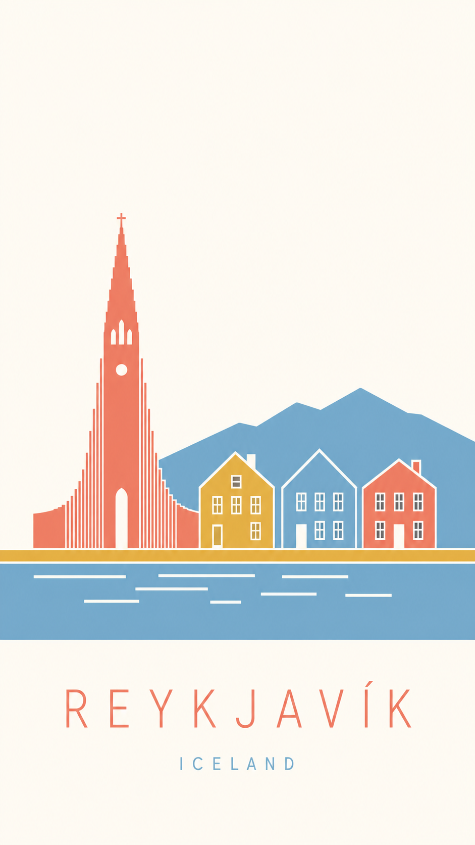
Scandinavian flat-vector (the default). The style phrase is the one already in the prompt: “in an ultra-clean mid-century-modern Scandinavian editorial style.” Soft, calm, three flat colors, simplified geometric houses on a clean line.
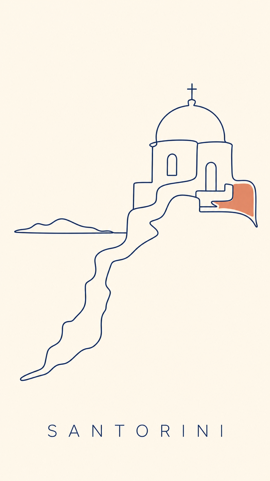
Single continuous-line. Swap the style phrase for: “as a single continuous-line drawing, one iconic form drawn in one unbroken line that never lifts, on a warm cream background with just one small flat block of color as the only fill.”
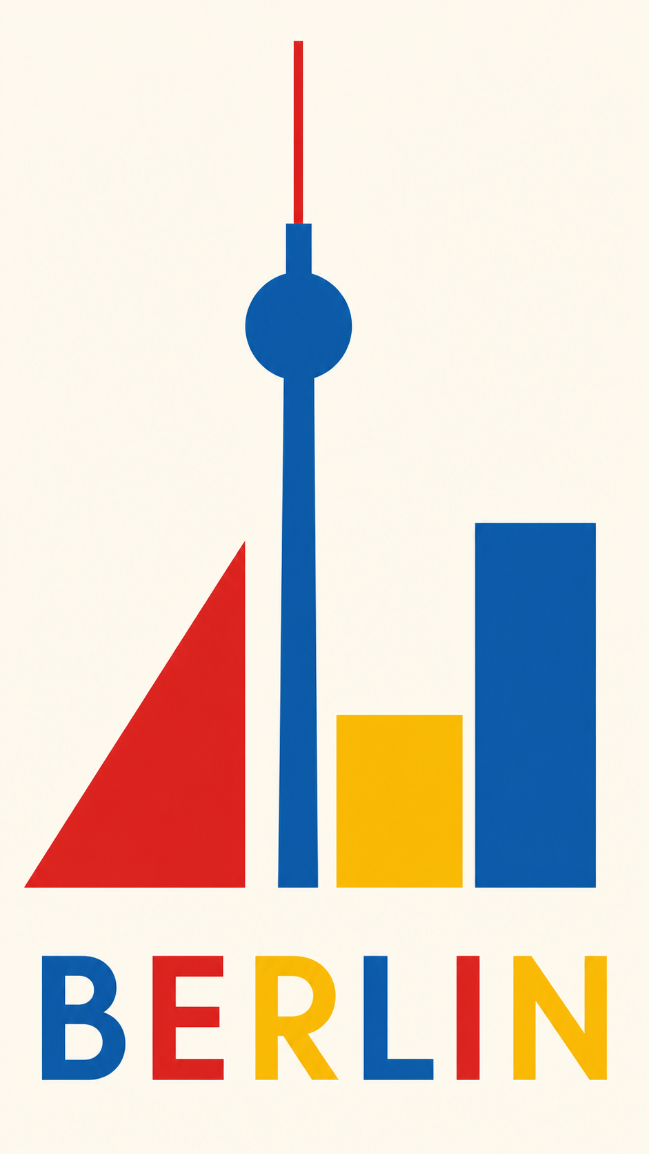
Bauhaus geometric. Swap the style phrase for: “in the geometric modernist Bauhaus style, the place reduced to pure flat shapes, circles, triangles, and bars, in primary red, blue, and yellow on off-white, with calm asymmetric balance.”
Two-tone risograph. Swap the style phrase for: “as a two-tone risograph print, only two riso inks, a bright fluoro coral-pink and a deep teal-blue, on warm off-white paper, the two inks overlapping in one place to make a third tone, with slight grain and a gentle registration offset.”
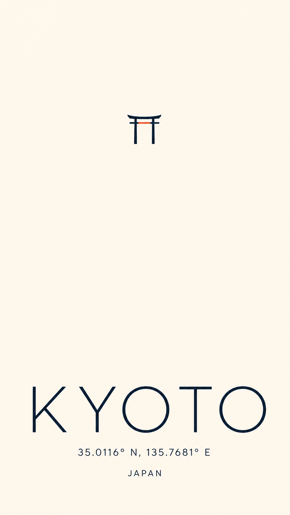
GPS-coordinate type-forward. Swap the style phrase for: “type-forward, typography is the hero, the place name large in light sans with its GPS coordinates small below, and one single tiny iconic form sitting in a vast empty field, two colors only with one small accent block.”
That is the whole trick: one chassis, five schools of minimalism. Pick the place, pick the look, and regenerate until the empty space feels calm.
One paste-ready AI art move a week, the kind you can use on a Tuesday or a Sunday. Subscribe to the newsletter.
Paste, render, refine, print
Once the prompt is in, the rest is mechanical.
- Paste the prompt and swap the two lines. Set the place and its one iconic form. The name or coordinate line follows. Optionally upload one travel photo of the place.
- Render it. You will have a poster in about two minutes. This is the same step that doubles as a full AI photoshoot move from one image once you see how far one prompt carries.
- Refine the two things that usually drift. If the place name or coordinates come out garbled, paste “render the place name and coordinates verbatim and spelled correctly in a light sans-serif” again. If the poster looks busy or shaded, paste “two or three flat colors only, no gradients, no shadows, dominant negative space, one iconic form.”
- Regenerate until all four rules land. This is the half the designer cannot give you. You are not paying $200 to wait days for a poster that is almost right. You regenerate free until it is right.
- Upscale and print. Ask the tool for the largest size it offers and save as PNG. Print at 300 dpi at a standard vertical poster size: 12 by 18, 18 by 24, or 24 by 36 inches. Frame it.
You can make this in the studio right now without leaving the page, then come back and print the one you keep.
Other poster styles you can make
The minimalist travel poster is one doorway. The same paste-render-print move re-skins into every other wall-art style, and each one has its own short list of rules the way this one has four.
- Vintage travel. A deep framed view, a local signature trio, a foreground frame, bold color, and a visible screen-print texture. (Guide: how to make a vintage travel poster.)
- Botanical print. A single specimen, centered and symmetrical, in a muted herbarium palette with a Latin-name label. (Guide coming soon: how to make a botanical poster.)
- Art deco. Geometric symmetry, a gold-and-black palette with one jewel tone, and stepped chevron borders. (Guide coming soon: how to make an art deco poster.)
- Mid-century modern. Boomerang and atomic-starburst shapes in a warm mustard-and-teal palette. (Guide coming soon: how to make a mid-century modern poster.)
Different style, same five minutes.
Key Takeaways
- A minimalist travel poster is a discipline, not a blank page: the 4 rules of a minimalist travel poster are two or three flat colors with no gradients, one iconic form in flat geometry, dominant negative space, and a tiny bottom-aligned place name or GPS coordinates.
- The two old routes both bill you before the reveal: a freelance designer commonly charges $50 to $200 over days, and design software costs you hours of skill-building. The AI prompt shows you the poster first.
- The prompt locks all four rules and leaves two lines open. You swap the place and its one iconic form, and regenerate free until the negative space reads as calm, not bare.
- Print at 300 dpi at a standard poster size and frame it. The same paste-render-print move re-skins into vintage, botanical, art deco, and mid-century styles.
FAQ
Q: How do you make a minimalist travel poster?
A: Four rules do almost all the work. Hold yourself to two or three flat colors with no gradients. Reduce the place to one iconic form, a mountain, a wave, a sun, an arch, drawn as flat geometry. Let negative space dominate, so most of the poster is calm and empty. Then set a tiny place name or its GPS coordinates in a light sans-serif along the bottom. The prompt in this article locks all four for you, so you paste, swap the place, and render.
Q: Can I make a minimalist poster without design software?
A: Yes. You no longer need Illustrator, Photoshop, Canva, or a designer. Paste the prompt above into any AI image tool, swap two or three lines for the place you want, and you get a print-ready minimalist travel poster in about two minutes. A custom poster from a freelance designer on a marketplace like Fiverr commonly runs from about $50 to $200 and takes days. The prompt costs you the price of a print, and you can regenerate it free until the negative space feels right.
Q: What makes a travel poster look minimalist and not just empty?
A: The discipline is the difference. A minimalist poster is not a blank page, it is one iconic form reduced to flat geometry, set in dominant negative space, in two or three colors, with a tiny place name or GPS coordinate line. The empty space is doing work, it frames the single form so the eye lands on it. The most common failure is the opposite of empty: too many colors, gradients, and elements fighting for attention. Strip those out and the poster reads as designed, not bare.
Q: Can I turn a travel photo into a minimalist poster?
A: Upload one photo of the place alongside the prompt. The AI uses the photo to get the real skyline, coastline, or landmark right, then reduces it to flat geometry and strips it to two or three colors. It does not keep the photographic detail, that is the whole point of the minimalist look. If you do not have a photo, the prompt still works from the place name alone and builds a clean idealized version.
What place would you put on the wall?
Not the place you photographed best. The place you keep meaning to get back to.
That is the one to put through the prompt first. You can have it framed and on the wall by the weekend, for the price of a print, and the whole job started with you swapping two lines. If you want a running set of these prompts in one place, they live in the image prompt shop.
So: what is the place?