
You found a place you love, and you want it on the wall as one of those romantic old travel posters: the Amalfi Coast in vibrant color, a convertible on a cliff road, lemons framing the view. So you priced it out. A custom poster from a designer runs real money and takes days, and the design software wants hours you do not have. Here is the third door: one AI prompt turns any destination into a gallery-grade vintage travel poster in about two minutes, with no design software and no designer.
Why the two normal routes both make you pay first
There are two normal ways to get a vintage travel poster, and both ask you to pay before you ever see it.
The first is to hire someone. A custom poster from a freelance designer on a marketplace like Fiverr commonly runs from about $50 to $200, and the good ones quote in days, not hours. You describe what you want, you wait, and the first time you see the actual poster is when it lands in your inbox. If it is wrong, you are into another revision round.
The second is to make it yourself in design software. Illustrator, Photoshop, and Canva can all do it. None of them will teach you what makes the style work, and mid-century poster illustration is its own craft. You can spend an evening learning the pen tool and still produce something that looks almost right and reads as off.
There is a real difference hiding in those two routes. One asks you to pay in money. The other asks you to pay in hours. The AI way asks for neither up front: you see the poster first, then decide if it earned a frame.
Here is the same choice laid out flat.
| Hire a designer | Learn the design software | The AI prompt way | |
|---|---|---|---|
| What it costs | About $50 to $200 for a custom poster on freelance marketplaces like Fiverr | $0 in cash, but the software subscription plus hours of your time | The price of a print. The prompt is free to run |
| How long until you see it | Days of back-and-forth; no preview before delivery | Hours to learn mid-century poster illustration well enough to not look off | About two minutes per render |
| Skill required | None, you outsource it | Real design skill in Illustrator, Photoshop, or Canva | None, you paste one prompt |
| Redo if it’s wrong | Costs another revision round, if the designer allows it | Start the file over | Regenerate free, as many times as you want |
| Looks authentically vintage | Depends entirely on the designer you drew | Only if you already know the six marks | Built in: the prompt locks all six marks |
Neither old route is a scam. They just both bill you before the reveal.
The 6 marks of a 1950s travel poster
Before the prompt, the taste. A vintage travel poster is not a vague mood you sprinkle on a photo. It is a specific look that mid-century European travel agencies used to sell a trip, and once you can name its parts, you can tell the AI to hit every one.
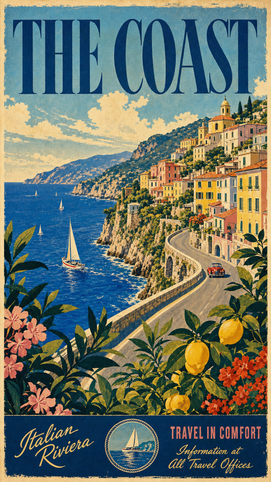
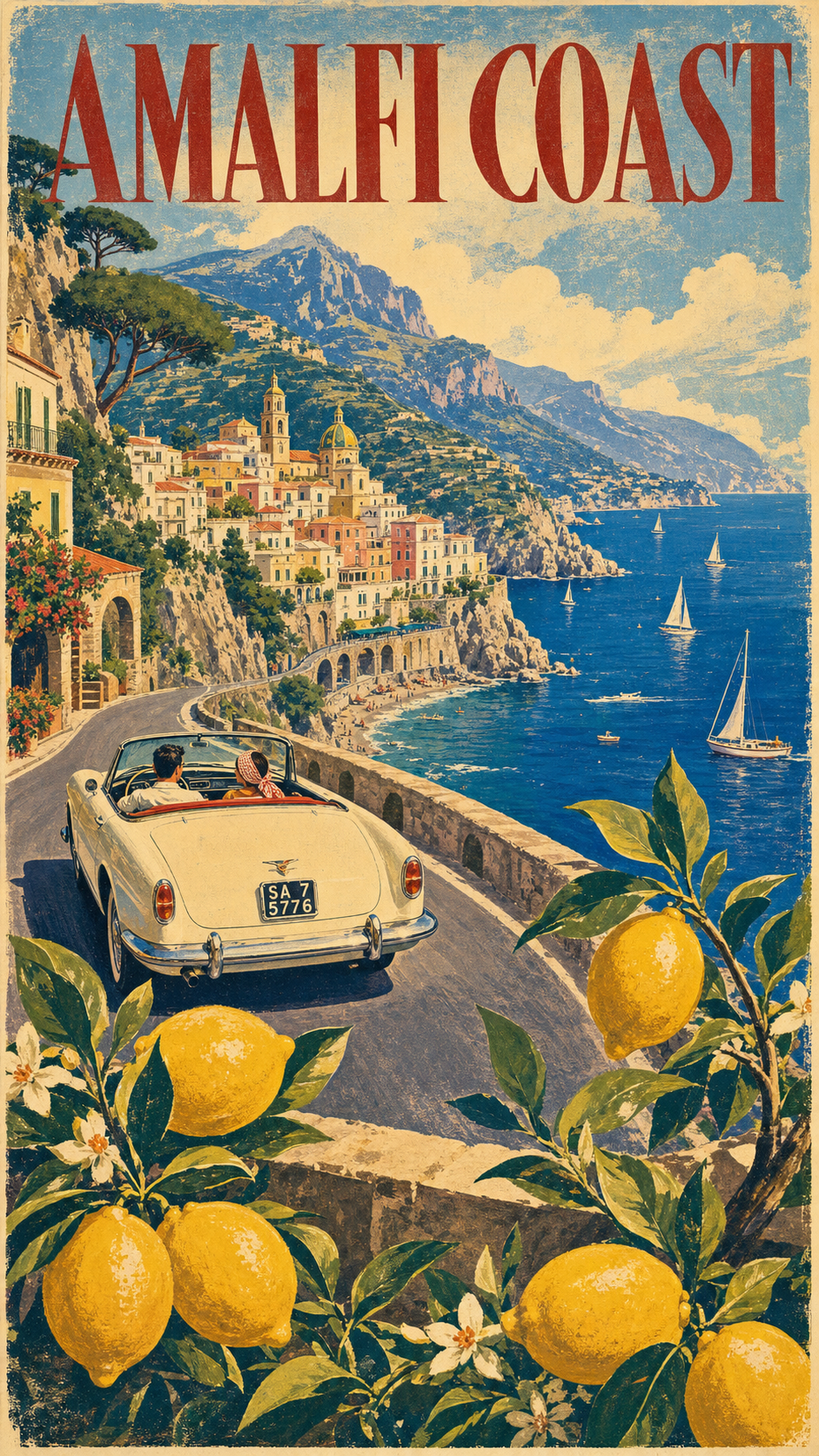
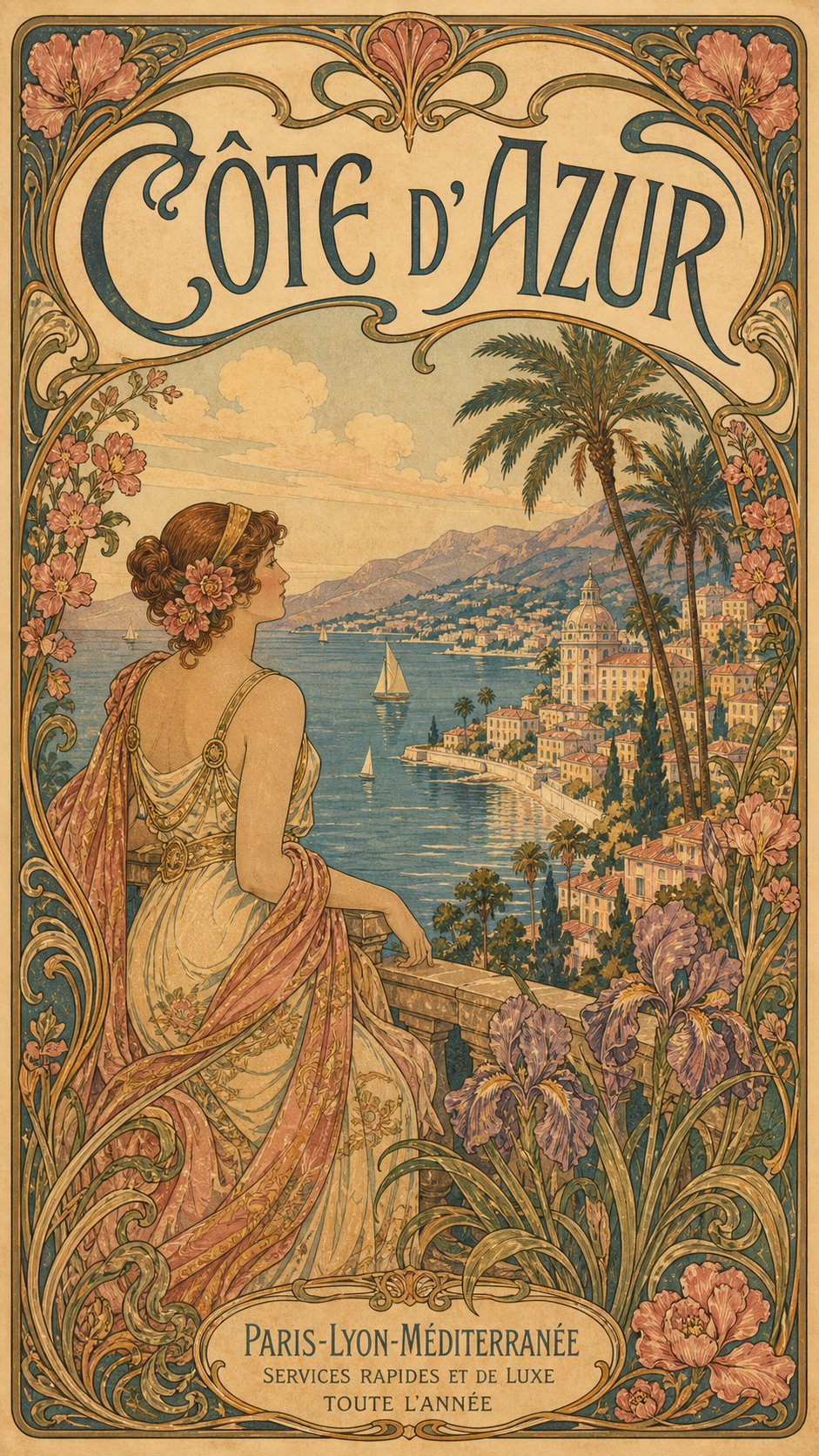
The posters people picture come from the golden age of tourism advertising, roughly the 1930s through the 1950s, made to sell train, ship, and motor-coach holidays. Strip the famous ones down and the same six things show up every time. Call them the 6 marks of a 1950s travel poster.
- A deep, framed view. Not a flat icon. A panoramic scene with real depth front-to-back: a foreground, a journey through the middle, and a destination in the distance. The eye travels into the poster.
- A local signature trio. Three things that together say this exact place: a period vehicle (a convertible, a Vespa, a 2CV, a wood-panel wagon), the signature landscape, and a foreground plant. The trio is what makes Amalfi read as Amalfi and not “a coast.”
- A foreground frame. Branches or plants, lemons, lavender, blossom, bougainvillea, filling the lower quarter and framing the view like you are looking out a garden window. This is the trick that creates depth.
- Bold, vibrant, high-contrast color. Saturated cobalt, sun-warm cream, lemon yellow, deep terracotta, in chromatic harmony from sky to foreground. Not muted pastels. This is mid-century bold, not modern minimal.
- A visible screen-print texture. Slightly imperfect, off-register color layers and hand-drawn strokes with defined contours, so it reads as a handmade lithograph from 1955, not a clean digital file.
- A big 1950s display title. The destination name across the top in large, elegant period display lettering, spelled correctly and part of the art, not a caption stuck on after.
Get these six right and the poster reads as a 1950s original. Miss them and you get a photo with a word on it, which is exactly what the prompt below is built to prevent.
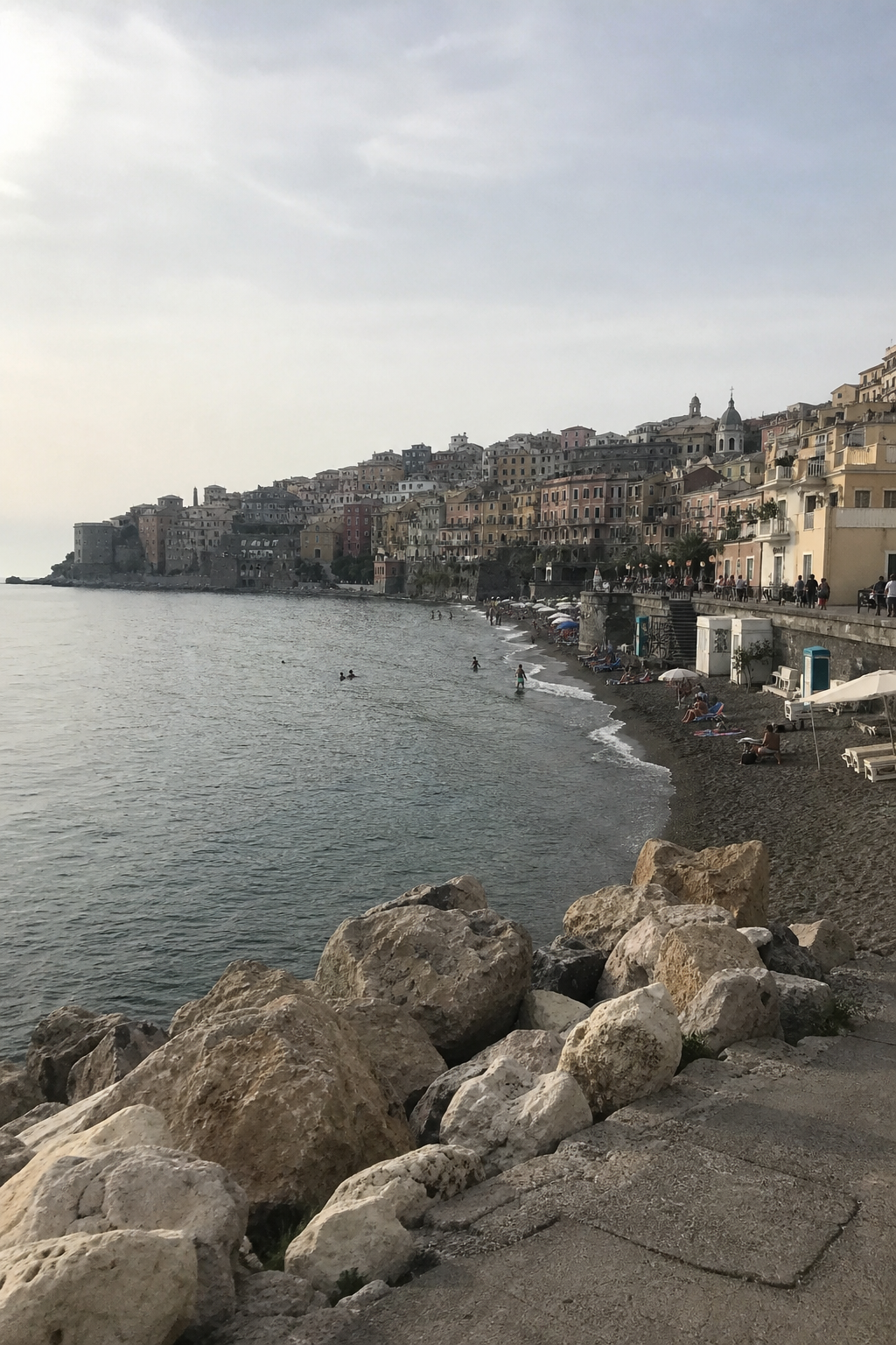
Here is the difference the six marks make. The same kind of place, the ordinary holiday snapshot first, then rebuilt to obey all six.
The prompt: paste it, swap three lines
Upload one travel photo of the place if you have it, paste the block below into ChatGPT, Gemini, or any AI image tool, and swap three lines for the destination you want on your wall.
Show the full promptTap to expand
Paste this into your AI (ChatGPT, Gemini, Claude, Midjourney).
Optional upload: one travel photo of the place. The AI uses it only to get the real coastline, landmark, or village right, then restyles it completely. No photo? The prompt still works from the destination name alone.
Generate this image:
A 9:16 vertical vintage 1950s screen-print travel poster of {DESTINATION}, in the unmistakable retro-illustration style of mid-century European tourism posters, with the poster title {POSTER_TITLE_TEXT} rendered in large elegant 1950s-style display typography across the top of the poster, spelled exactly as written and clearly legible. A panoramic scene fills the frame: {LOCAL_SIGNATURE_TRIO}. Warm summer sunlight, bold vibrant high-contrast colors, cinematic composition, generous visual depth front-to-back. Visible screen-print texture with slightly imperfect off-register color layers, hand-drawn loose strokes with defined contours, chromatic harmony between sky, landscape, and foreground. The poster feels like a framed travel-agency window display from 1955: decorative, romantic, and unmistakably handcrafted.
Rules the AI must follow:
- Aspect ratio 9:16 vertical, stated at the start and again here at the end.
- Render the title
{POSTER_TITLE_TEXT}verbatim and spelled correctly in large 1950s display type. No garbled letters, no character substitutions, all text in English Latin script. - Visible screen-print texture, hand-drawn strokes, slightly off-register color layers. No photoreal rendering, no smooth digital vector, no modern flat-illustration look.
- Bold high-contrast color palette with chromatic harmony. Not muted pastels.
- The foreground plant or branches occupy the lower 25% and frame the view like a garden window.
- Single image only. No moodboard, no contact sheet, no variant grid. Output the image directly.
Replace these placeholders with your details:
{DESTINATION}= the place you want, e.g.the Amalfi Coast, Italy{LOCAL_SIGNATURE_TRIO}=a classic 1960s white convertible on a curved cliffside road, deep blue Mediterranean sea with small sailboats below, a colorful pastel hillside village climbing the slope, and lemon tree branches with vibrant yellow lemons framing the lower foreground{POSTER_TITLE_TEXT}=AMALFI COAST(your destination name, short, in capitals)
Bonus tips. Swap all three lines at once for a coordinated new destination. Santorini: a cream Vespa at a viewpoint, the blue Aegean caldera with white-and-blue domed churches, olive branches framing the foreground, title SANTORINI. California Coast: a 1960s wood-panel wagon on the cliff highway, the Pacific with sea-stacks, golden hills, palm and bougainvillea framing, title CALIFORNIA COAST. Provence: a cream Citroën 2CV on a lane, rolling lavender fields and a stone village, lavender and sunflowers framing, title PROVENCE. For different colors, add a palette line: “soft pastel sunrise,” “punchy chartreuse and coral mid-century pop,” or “sun-bleached as if it hung in a window for 30 years.” If the title comes out garbled, paste the title rule once more at the very end.
The prompt is doing four jobs you would otherwise hire out.
- It names all six marks as hard rules, so the model builds the style instead of guessing at “vintage.”
- It states the title rule and the 9:16 aspect twice, once at the top and once at the close, because a constraint repeated at the end of a prompt holds better than one stated only once.
- It leaves three lines open, the destination, its signature trio, and the title, and locks everything else. Those three lines are where your trip enters the poster.
- It tells the AI to treat any uploaded photo as a reference for the real place, then restyle it, so your photo guides the scene without dragging photographic texture in. If the result still drifts toward the generic plastic look that gives AI images away, the screen-print rule is your fix.
Five vintage looks, one prompt
The prompt above is a chassis. The three placeholder lines put your place in it; the style line decides the era. Keep everything else and swap that one phrase, “in the unmistakable retro-illustration style of mid-century European tourism posters,” for another, and the same scene re-skins into a completely different vintage style. Here are five, starting with the 1950s European screen-print the main prompt builds by default.
1950s European screen-print (the default). The style line is the one already in the prompt: “in the unmistakable retro-illustration style of mid-century European tourism posters.” Lush and high-contrast, a framed cliff view with a foreground of lemon branches.
1930s WPA national-park. Swap the style line for: “in the flat, geometric 1930s American WPA ‘See America’ national-park screen-print style, a limited four-to-six-color flat palette, an airbrushed gradient sky, bold condensed lettering.”
Art Nouveau (Belle Époque). Swap the style line for: “in the ornate 1900s Art Nouveau Belle Époque style of Alphonse Mucha and the old PLM railway posters, sinuous organic linework, a decorative floral border, a soft jewel palette, flowing lettering.” Mucha’s 1897 “Monaco-Monte-Carlo” poster for the PLM railway, held in the Mucha Foundation collection, is the template the AI is reaching for: a sinuous floral frame around a dreamy bay.
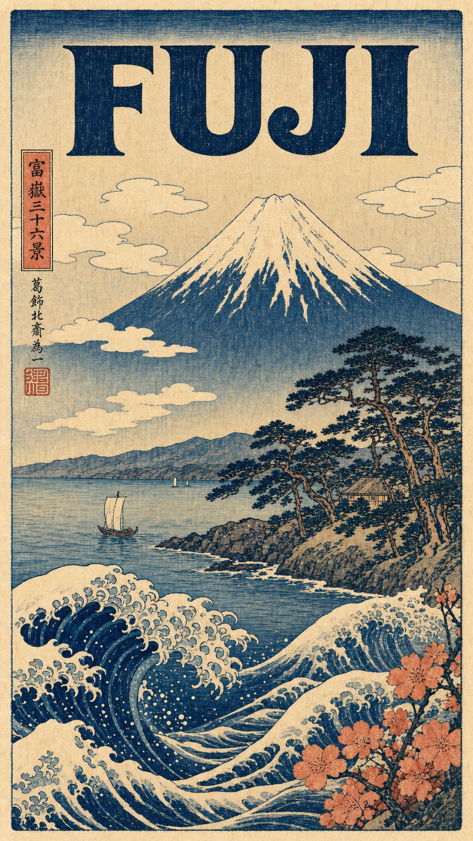
Japanese woodblock (ukiyo-e). Swap the style line for: “in the Edo-period Japanese ukiyo-e woodblock-print style of Hokusai and Hiroshige, flat woodblock color, carved outlines, visible woodgrain and slight registration offset, on washi paper.”
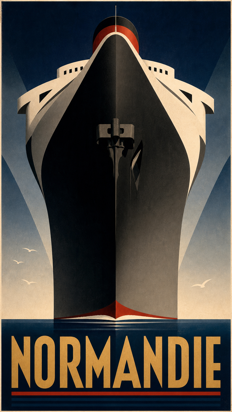
Art Deco ocean-liner (Cassandre). Swap the style line for: “in the monumental geometric 1930s Art Deco style of A.M. Cassandre’s Normandie poster, a dramatic low-angle view, bold flat geometric color blocks, a restrained navy, black, and gold palette, geometric display capitals.” Cassandre’s 1935 “Normandie” poster, in the V&A collection, is the one to picture: the ocean liner shot from below as a towering wall of steel.
That is the whole trick: one chassis, five eras. Pick the place, pick the era, and regenerate until it sings.
One paste-ready AI art move a week, the kind you can use on a Tuesday or a Sunday. Subscribe to the newsletter.
Paste, render, refine, print
Once the prompt is in, the rest is mechanical.
- Paste the prompt and swap the three lines. Set the destination, the local signature trio, and the title text. Optionally upload one travel photo of the place.
- Render it. You will have a poster in about two minutes. This is the same step that doubles as a full AI photoshoot move from one image once you see how far one prompt carries.
- Refine the two things that usually drift. If the title text comes out garbled, paste “render the poster title verbatim and spelled correctly in large 1950s display type” again. If the image looks flat or photoreal, paste “visible screen-print texture, slightly off-register color layers, hand-drawn strokes, bold high-contrast color, not photoreal.”
- Regenerate until all six marks land. This is the half the designer cannot give you. You are not paying $200 to wait days for a poster that is almost right. You regenerate free until it is right.
- Upscale and print. Ask the tool for the largest size it offers and save as PNG. Print at 300 dpi at a standard vertical poster size: 12 by 18, 18 by 24, or 24 by 36 inches. Frame it.
You can make this in the studio right now without leaving the page, then come back and print the one you keep.
Other poster styles you can make
The vintage travel poster is the doorway. The same paste-render-print move re-skins into every other wall-art style, and each one has its own short list of marks the way this one has six.
- Botanical print. A single specimen, centered and symmetrical, in a muted herbarium palette with a Latin-name label. (Guide coming soon: how to make a botanical poster.)
- Art deco. Geometric symmetry, a gold-and-black palette with one jewel tone, and stepped chevron borders. (Guide coming soon: how to make an art deco poster.)
- Minimalist travel. Two or three flat colors, one iconic form, and a lot of negative space. (Guide coming soon: how to make a minimalist travel poster.)
- Mid-century modern. Boomerang and atomic-starburst shapes in a warm mustard-and-teal palette. (Guide coming soon: how to make a mid-century modern poster.)
Different style, same five minutes.
Key Takeaways
- A vintage travel poster is a named style, not a vibe: the 6 marks of a 1950s travel poster are a deep framed view, a local signature trio, a foreground frame, bold vibrant color, a visible screen-print texture, and a big display title.
- The two old routes both bill you before the reveal: a freelance designer commonly charges $50 to $200 over days, and design software costs you hours of skill-building. The AI prompt shows you the poster first.
- The prompt locks all six marks and leaves three lines open. You swap the destination, its signature trio, and the title, and regenerate free until it reads as a 1950s original.
- Print at 300 dpi at a standard poster size and frame it. The same paste-render-print move re-skins into botanical, art deco, minimalist, and mid-century styles.
FAQ
Q: How do you make a poster look vintage?
A: Six things do almost all the work. Build a deep, framed view instead of a flat icon. Add a local signature trio: a period vehicle, the landscape, and a foreground plant. Frame the lower quarter with branches so it reads like looking out a garden window. Use bold, vibrant, high-contrast color, not muted pastels. Add a visible screen-print texture with slightly off-register layers so it looks handcrafted, not digital. Then run the destination name across the top in big 1950s display type. The prompt in this article locks all of that for you.
Q: Can I create my own travel poster?
A: Yes, and you no longer need design software or a designer to do it. Paste the prompt above into any AI image tool, swap three lines for the place you want, and you get a print-ready vintage travel poster in about two minutes. A custom poster from a freelance designer on a marketplace like Fiverr commonly runs from about $50 to $200 and takes days. The prompt costs you the price of a print, and you can regenerate it free until it looks right.
Q: How do you turn a travel photo into a vintage poster?
A: Upload one photo of the place alongside the prompt. The AI uses the photo to get the real landmark, coastline, or village right, then restyles it completely into the 1950s screen-print look the prompt describes. It does not keep the photographic texture. If you do not have a photo, the prompt still works from the destination name alone and builds an idealized version of the place.
Q: What style are old travel posters?
A: The posters people picture are the mid-century European tourism posters of the 1930s to 1950s, made to sell train, ship, and motor-coach travel. They share a recognizable look: a deep, romantic painted view of a destination, bold high-contrast color, a visible screen-print texture, a period vehicle in the scene, and the place name in large display lettering. That handmade, vibrant, framed-view style is what this prompt recreates.
What place would you put on the wall?
Not the place you photographed best. The place you keep meaning to get back to.
That is the one to put through the prompt first. You can have it framed and on the wall by the weekend, for the price of a print, and the whole job started with you swapping three lines. If you want a running set of these prompts in one place, they live in the image prompt shop.
So: what is the place?